
Forum
25 posts Caratteri Identificati Solo richieste
Posts di @seanfrasure
I agree, that's probably it besides the "M".
Thanks!
Modificato 2 volte. Ultima modifica su 19/04/2018 alle 11:59 da frd
Modificato 2 volte. Ultima modifica su 19/04/2018 alle 11:59 da frd
This isn't the same as the previous post. Thanks!

Modificato su 19/04/2018 alle 02:36 da @seanfrasure
Immagine originale: https://i.gyazo.com/bb13a54194b49b7169a82fdedc309a39.png
Modificato su 19/04/2018 alle 02:36 da @seanfrasure
Hey, I was looking for what font this is.
Here are some other examples of it in use: https://i.ytimg.com/vi/eUd6Z_zyXZM/maxresdefault.jpg , https://i.ytimg.com/vi/WtftZPL-k7Y/maxresdefault.jpg

Here are some other examples of it in use: https://i.ytimg.com/vi/eUd6Z_zyXZM/maxresdefault.jpg , https://i.ytimg.com/vi/WtftZPL-k7Y/maxresdefault.jpg
Immagine originale: https://i.ytimg.com/vi/SDlSVE0X3Ao/maxresdefault.jpg
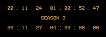
Carattere Identificato: VCR OSD Mono
Modificato su 28/03/2017 alle 01:57 da @seanfrasure
BUMP
Debunk:
The "d","y", and "s" are notably different.
Note: I just wanted to bump this back up being basically dead for 4 years.
Modificato su 27/10/2016 alle 02:53 da @seanfrasure
Debunk:
The "d","y", and "s" are notably different.
Note: I just wanted to bump this back up being basically dead for 4 years.
Modificato su 27/10/2016 alle 02:53 da @seanfrasure
tdawgthefirst ha detto 
@seanfrasure ha detto
none of those... the dot above the "i" is too close to its body in the logo.
There is a thing called modification... http://www.underconsideration.com/brandnew/archives/new_logo_and_identity_for_logitech_by_designstudio.php#.WAebv5MrL_R
"The logotype nods to Logitechs 30-year heritage with the use of the Brown Pro typeface, designed by Aurèle Sack from Lausanne, Switzerland, the birthplace of Logitech and still where its EMEA headquarters are based. The logo also takes inspiration from Paul Renners experimental sketches for his now classic modernist typeface, Futura."
It's definitely Brown Pro Bold
The "e", "t", "i" and the "h" are all notably different.
"e" - the "tail" of the "e" is too close to the "head" in the logo.
"t" - the "t" in Brown Pro Bold has a tail.
"i" - the "dot" is to big and far up in Brown Pro Bold.
"h" - the interior of the "h" is more round/blended in the logo compared to the "h" in Brown Pro Bold.
It's not Brown Pro Bold... refer to: https://lineto.com/The%20Fonts/Font%20Categories/Text%20Fonts/Brown/ and compare the letters.
Modificato su 19/10/2016 alle 20:53 da @seanfrasure
none of those... the dot above the "i" is too close to its body in the logo.
Modificato su 19/10/2016 alle 13:50 da @seanfrasure
Modificato su 19/10/2016 alle 13:50 da @seanfrasure
Looking for the font used in this magazine

Fontiane ha detto
That seems to be the old logo. This is the most recent one.
Modificato su 03/10/2016 alle 16:41 da frd
Bump
tmp20141018 ha detto
I found the font, which was custom-made for Google. The font files were found in the Androidify APK. There are three files: two OTFs and one TTF. It is called "and"; there are two variants: "light" and "black." Here is more information from the metadata of one of those files:
Full font name
and black
Postscript name
and-black
Designer
A2-TYPE, Henrik Kubel
Description
Copyright (c) 2014 by . All rights reserved.
License Description
Exclusive use of Google Android. Not for commercial release or distribution. All rights reserved.
Copyright
Copyright (c) 2014 by A2-TYPE, Henrik Kubel. All rights reserved.
Version string
Version 1.005
Trademark
and black is a trademark of A2-TYPE, Henrik Kubel.
Manufacturer
A2-TYPE, Henrik Kubel
URL Vendor
http://www.a2-type.co.uk
URL Designer
http://www.a2-type.co.uk
License Info URL
Not commercially available
Preferred Family
and
Preferred Subfamily
black
Unique font identifier
A2-TYPE,HenrikKubel: and black: 2014
P.S. You can tell it is not Steiner by looking at the lowercase 'U' and 'W' and comparing to the 'android wear' and 'android auto' images.
And
To the "u" and "w" comment: The Android Wear and Android Auto logos use different fonts then the Android L logo. For THIS logo it is Steiner. Take a look at the "n". Steiner has the top tail and And doesn't. But for the Android Wear and Android Auto it might be the "And" font. (Might because of the "n")
Modificato su 15/07/2016 alle 14:36 da @seanfrasure
Product Sans is now available for download: http://xamphyx.com/resources/downloads/fonts/product-sans/

Sharp Sans (v1) by Lucas Sharp http://paganandsharp.com/typefaces/sharp-sans/
Modificato su 15/07/2016 alle 13:46 da @seanfrasure
Carattere Identificato: Sharp Sans
Modificato su 15/07/2016 alle 13:46 da @seanfrasure

Its Sharp Sans (v1) by Lucas Sharp. Its also known as Samsung Sharp Sans (ss-sans). It has 20 styles. http://paganandsharp.com/typefaces/sharp-sans/
Modificato su 15/07/2016 alle 13:46 da @seanfrasure
Carattere Identificato: Sans Sharp
Modificato su 15/07/2016 alle 13:46 da @seanfrasure

The font is Sharp Sans (v1) by Lucas Sharp http://paganandsharp.com/typefaces/sharp-sans/
Modificato su 15/07/2016 alle 13:46 da @seanfrasure
Carattere Identificato: Sharp Sans
Modificato su 15/07/2016 alle 13:46 da @seanfrasure

Sharp Sans V1 http://paganandsharp.com/typefaces/sharp-sans/
Modificato 2 volte. Ultima modifica su 19/07/2016 alle 15:35 da Lemmiwinks
Carattere Identificato: Sharp Sans
Modificato 2 volte. Ultima modifica su 19/07/2016 alle 15:35 da Lemmiwinks
Here are some other logos with the same font:
http://www.dafont.com/forum/attach/orig/5/3/539864.png
https://yt3.ggpht.com/-CX-X2c1vhEs/AAAAAAAAAAI/AAAAAAAAAAA/D_0j_j0NEns/s900-c-k-no-rj-c0xffffff/photo.jpg
https://pbs.twimg.com/profile_images/488509182581043200/CtNVjYVC.png
https://yt3.ggpht.com/-pWONh-Le-7I/AAAAAAAAAAI/AAAAAAAAAAA/tlGU4K-2MDU/s900-c-k-no-rj-c0xffffff/photo.jpg
It's not Arial. Look at the intersection of the curve with the "r" and "n". Also look at the thickness of the top line of the "T".

Carattere suggerito: Badaboom BB (Già suggerito qua)
Fuso orario: CEST. Ora sono le 09:31
