
Forum
3 posts
Posts di ambient102389
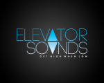
Its "Century Gothic". the letter "A" in Elevator and "U" in Sounds were custom made. hope this helps.
Modificato su 24/06/2013 alle 17:31 da fmontpetit
Carattere suggerito: Century Gothic
Modificato su 24/06/2013 alle 17:31 da fmontpetit

Hi, i believe that its "Magneto" there were some changes such as the Capital "L" and "g". they also increased the character spacing. hope this helps
Modificato su 24/06/2013 alle 17:28 da fmontpetit
Carattere suggerito: Magneto
Modificato su 24/06/2013 alle 17:28 da fmontpetit

Its "Garamond", the typographer/artist stretched the fonts/ text box, edited some ligatures making them a bit longer than the default creating a classic "country" feel. hope this helps 
Modificato su 24/06/2013 alle 17:36 da drf

Carattere suggerito: Garamond
Modificato su 24/06/2013 alle 17:36 da drf
Fuso orario: CEST. Ora sono le 18:04
