
Forum
660 posts Caratteri Identificati Solo richieste
Posts di ITellYa

Squack ha detto 
Pretty sure the K is wrong but otherwise it's perfect.
I saw that, but have you seen that the edges of the 'K' are way more clear than the rest of the text? So I guess the 'K' has been designed by hand.


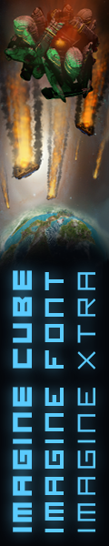
Carattere Identificato: Futura D Extra Bold Condensed

Carattere Identificato: Impact Bold

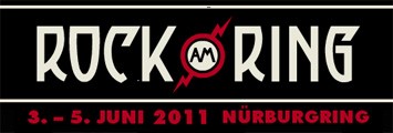
Carattere Identificato: Republika

Carattere suggerito: Helvetica Roman


Carattere Identificato: Swiss 721 Light
Carattere Identificato: Interstate Cond Black
I haven't changed it, but the site you refer to, has a lot of illegal downloads.
rocamaco ha detto
SmiLeyCyrUs2 ha detto
SimuyMara?
Non ti preoccupare, Itellya leggere la dichiarazione di nuovo e si risolverą il dubbio ...
 ...
...Whoops, wrong text... Sorry, I don't know the pixel/bitmap font.

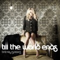
Carattere Identificato: Britney Spears FF

Carattere Identificato: Times Bold

Carattere Identificato: Zeroes One
Carattere Identificato: Fortune Cookie NF
Fuso orario: CEST. Ora sono le 05:57
