
Forum
3.821 posts Caratteri Identificati
Posts di donshottype


Sezessions-Grotesk by Klinkhardt 1905 ca.
Other names include:
Arabian Stephenson Blake
Melpomene Società Augusta
For info see https://fontsinuse.com/typefaces/46844/sezessions-grotesk
No exact match in a digital font. Text Gothic by ABC Types is similar
Modificato su 17/11/2019 alle 11:18 da donshottype
Other names include:
Arabian Stephenson Blake
Melpomene Società Augusta
For info see https://fontsinuse.com/typefaces/46844/sezessions-grotesk
No exact match in a digital font. Text Gothic by ABC Types is similar
Carattere Identificato: Sezessions-Grotesk
Modificato su 17/11/2019 alle 11:18 da donshottype
Do you have any more CDs using this style of lettering?

From cover of Bantam paperback, 1968
It uses Permanent Headline, designed by Karlgeorg Hoefer in the mid 1960s.
Modificato 2 volte. Ultima modifica su 13/11/2019 alle 23:44 da donshottype
It uses Permanent Headline, designed by Karlgeorg Hoefer in the mid 1960s.
Carattere Identificato: Permanent Headline
Modificato 2 volte. Ultima modifica su 13/11/2019 alle 23:44 da donshottype

Outline added by logo maker. Width compressed for lc in bottom line. Minor modifications, e.g. bottom of _v_.
Carattere Identificato: Goudy Text

Perhaps not a font.
Plakette TS Light is similar but has big ink traps and some minor differences.
Plakette TS Light is similar but has big ink traps and some minor differences.
Carattere suggerito: Plakette TS Light

Using alternate _E_ found in Herb Lubalin's predigital version.
The original phototype version contained many alternates that have not been digitized:
https://1.bp.blogspot.com/--nf0mJWMLG4/UR0-Y4lvceI/AAAAAAAAPX8/vbEIAfQ1YqQ/s1600/Serif+Gothic+03.jpg
Also see predigital usage:
https://fontsinuse.com/uses/15215/advertising-who-needs-it-pullquotes
Modificato 5 volte. Ultima modifica su 08/11/2019 alle 09:29 da donshottype
The original phototype version contained many alternates that have not been digitized:
https://1.bp.blogspot.com/--nf0mJWMLG4/UR0-Y4lvceI/AAAAAAAAPX8/vbEIAfQ1YqQ/s1600/Serif+Gothic+03.jpg
Also see predigital usage:
https://fontsinuse.com/uses/15215/advertising-who-needs-it-pullquotes
Carattere Identificato: ITC Serif Gothic
Modificato 5 volte. Ultima modifica su 08/11/2019 alle 09:29 da donshottype

Carattere Identificato: FancyText

Coign 26 SemiBold
Modificato 2 volte. Ultima modifica su 05/11/2019 alle 11:30 da donshottype
Carattere Identificato: Coign 26 SemiBold
Modificato 2 volte. Ultima modifica su 05/11/2019 alle 11:30 da donshottype
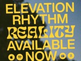
Closest I found was Druk Condensed XX Super.
This is not an exact match but has a similar weight and height to width ratio.
Still looking.
Modificato su 06/11/2019 alle 02:58 da donshottype
This is not an exact match but has a similar weight and height to width ratio.
Still looking.
Carattere suggerito: Druk Condensed XX Super
Modificato su 06/11/2019 alle 02:58 da donshottype

Re-lettered with minor simplification, such as deletion of hairlines on _M_ & _a_. longer terminal on _r_.
Carattere Identificato: Agincourt


This is a specimen of an Italic type by Ludovico Vicentino degli Arrighi, c.a. 1527.
It was revived as the Italic for several fonts, including Centaur.
It was revived as the Italic for several fonts, including Centaur.
Carattere suggerito: Centaur Italic

Carattere Identificato: Portcullion


Carattere suggerito: Georgia

Looks like Playbill with height compressed to 46 percent:

Modificato su 13/10/2019 alle 13:03 da donshottype
Carattere Identificato: Playbill
Modificato su 13/10/2019 alle 13:03 da donshottype
Fuso orario: CEST. Ora sono le 23:50
