
Forum
158 posts Caratteri Identificati
Posts di elmo


Carattere suggerito: Grecian Bold


Esta cabecera está rotulada a mano (fíjate en la diferente curvatura de los arcos superior e inferior de la "O", o en la diferencia entre los signos "¡" y "!"). Era una práctica bastante corriente hace 30 ó 40 años, antes de la popularización de los ordenadores.

Carattere suggerito: Helvetica
Carattere Identificato: Mistral
It's not a font, It's an standard in calligraphy, a word ("minimum") to probe the pulse of the calligrapher.

Carattere suggerito: Core Sans G 75 ExtraBold


Carattere suggerito: Arnprior

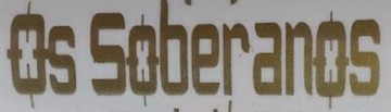
Carattere Identificato: Glaser Stencil

Está totalmente hecha a mano, en mi opinión; no es una fuente que puedas encontrar. En los 90's era habitual poner caligrafías especialmente hechas en la portada de los discos.
Elmo
Elmo

You can draw a simple glyph and cup and copy and repeat it... I've make some similar works to improve a text or a logo! And then it was much more usual than now!
It's not a font.
http://plaintxt.org/font_used_on_both_elvis_s_first_album_and_the_clash_s_london_calling_7107443.html
Modificato su 10/06/2014 alle 15:11 da drf
http://plaintxt.org/font_used_on_both_elvis_s_first_album_and_the_clash_s_london_calling_7107443.html
Modificato su 10/06/2014 alle 15:11 da drf
This is not a font, this is one of the five ambigrams created by the great designer John Langdon for the Dan Brown's book (and film) "Angels&Demons". http://www.johnlangdon.net/works/angels-demons/
Modificato su 10/06/2014 alle 13:05 da drf
Modificato su 10/06/2014 alle 13:05 da drf

Fuso orario: CEST. Ora sono le 15:33
