
Forum
1.319 posts Caratteri Identificati Solo richieste
Posts di elzadra


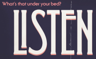
Carattere Identificato: Ronda

It's basically gaspipe lettering. Evogria matches the caps pretty well but hasn't got a lower case.
Carattere suggerito: Evogria
Thanks!


Carattere Identificato: Rockwell Bold

Thanks!


Carattere Identificato: DIN

Carattere Identificato: Motter Ombra
Carattere Identificato: Crillee Italic

Carattere Identificato: Mistral

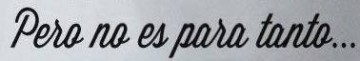
The L's are different and the o's are different those could be different glyphs, but I'm guessing this is custom.
Try Manhattan Darling (Creative Market) or Wanderlust for a similar vibe.
Try Manhattan Darling (Creative Market) or Wanderlust for a similar vibe.
Carattere suggerito: Wanderlust

Carattere Identificato: Algerian
Carattere Identificato: Serif Gothic
Carattere Identificato: Wisdom Script

Carattere Identificato: Modesto Bold Condensed
Fuso orario: CEST. Ora sono le 16:40
