
Forum
3.821 posts Caratteri Identificati
Posts di donshottype


Made from Impact.
The repeating letters have different textures, which means that they were added by the user and there is not a font with this texture.
The repeating letters have different textures, which means that they were added by the user and there is not a font with this texture.
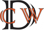
Carattere Identificato: Impact

Carattere Identificato: Bank Gothic Medium


FANTASIA is a revision of the hand-lettered title of the the 1940s Fanstasia, which looked like:

It appeared after the release, in 1940, of a typeface called Electra by Carlos Winkow for Nacionel, a Spanish foundry.
This is the probable inspiration for the lettering of the original Fantasia, and indirectly of Fantasia 2000.
It appeared after the release, in 1940, of a typeface called Electra by Carlos Winkow for Nacionel, a Spanish foundry.
This is the probable inspiration for the lettering of the original Fantasia, and indirectly of Fantasia 2000.
Carattere suggerito: Romeo Medium Condensed
Carattere Identificato: Snell Roundhand Bold Script
Carattere Identificato: Colonna
Tatoos can vary a lot from source fonts and are often based on a lettering style unique to the tatoo artist rather than a font.
Don't recall a font that is an exact match to this tatoo.
Don't recall a font that is an exact match to this tatoo.

Carattere Identificato: Garamond Premier

Carattere Identificato: Cascade Script

Carattere Identificato: Ahkio Bold
Unfortunately the digital outlines of Aldo the Apache are lifted with exact point for point matching from another font, Maus, without any credit to James Arboghast, the author of Maus. Maus includes a shadow effect not included in Aldo the Apache.

See Maus at Dafont: http://www.dafont.com/maus.font?text=BASSRUSH&psize=l
See Maus at Dafont: http://www.dafont.com/maus.font?text=BASSRUSH&psize=l

Similar should have chamfered counters like Abolition.
However, Abolition is too narrow, the chamfers are not large enough and it is not quite the right weight.
Modificato su 08/08/2017 alle 14:34 da donshottype
However, Abolition is too narrow, the chamfers are not large enough and it is not quite the right weight.
Carattere suggerito: Abolition
Modificato su 08/08/2017 alle 14:34 da donshottype

Aldo the Apache is a fair match if chamfer is converted to box corner on lower lhs and upper rhs of _B_, and upper lhs of _A_ and _R_
Carattere suggerito: Aldo the Apache

Carattere Identificato: Komika Axis
The phrase _Meine Ehre heißt Treue_ ("My honour is called loyalty") is the motto of the defunct Nazi organization called Schutzstaffel (the infamous SS).
Your letters were probably produced between 1931 and 1945.
I found the original of your image on a neo-Nazi website, which shows them apparently engraved on an SS blade:

Although the letters are clearly based on the style in Koch's Maxmilian, it its possible that Maxmilian was never produced as a font with this lighter weight.
BTW, the use of this motto or variations of it is prohibited [since 1947] in several countries, including Austria and Germany
Modificato 2 volte. Ultima modifica su 07/08/2017 alle 21:31 da donshottype
Your letters were probably produced between 1931 and 1945.
I found the original of your image on a neo-Nazi website, which shows them apparently engraved on an SS blade:
Although the letters are clearly based on the style in Koch's Maxmilian, it its possible that Maxmilian was never produced as a font with this lighter weight.
BTW, the use of this motto or variations of it is prohibited [since 1947] in several countries, including Austria and Germany
Modificato 2 volte. Ultima modifica su 07/08/2017 alle 21:31 da donshottype
Fuso orario: CEST. Ora sono le 19:21
