
Forum
2.418 posts Caratteri Identificati Solo richieste
Posts di malvolio


The T in Terres is actually lower case.
Modificato su 03/10/2012 alle 17:16 da malvolio
Carattere suggerito: Bickley Script
Modificato su 03/10/2012 alle 17:16 da malvolio
You're welcome!
I know, you said that I mention them all the time.
That doesn't mean anything.
Drf_, you don't even know me well, so can you please stop posting those kind of comments?
That doesn't mean anything.
Drf_, you don't even know me well, so can you please stop posting those kind of comments?

Carattere Identificato: Serpentine
http://www.dafont.com/theme.php?cat=601&text=Union
Similar ones here.
Similar ones here.
daaams ha detto 
Malvolio, are you employed by fontpanda ? You mention their name in every message you post...
No I am not. Why would I be?

Carattere suggerito: Always Forever
You're welcome!

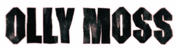
http://www.dafont.com/hollywood-hills.font?text=OLLY+MOSS
This one is similar.
Modificato su 03/10/2012 alle 09:26 da drf_
This one is similar.
Carattere suggerito: SF Hollywood Hills
Modificato su 03/10/2012 alle 09:26 da drf_
You're welcome. This font comes with MS Office.
That isn't a font, but I'm trying to figure out what it the most similar...
Are you looking for the same curly feel, or just the script-ishness part?
Are you looking for the same curly feel, or just the script-ishness part?
Carattere Identificato: Caslon Antique


Carattere Identificato: Peignot Bold
Well...any font with gaps like that will look digital. If you want a font that looks exactly like the one you made, you can make it yourself here: www.fontpanda.com or with the Fonts for Peas people.
It's fuzzy, but it's still incredibly easy to tell the font. 

Carattere Identificato: Lucida Handwriting
No, I wasn't. So either I have Alzheimers, or you went to a page that was not my link,
Fuso orario: CEST. Ora sono le 07:28
