
Forum
1.319 posts Caratteri Identificati Solo richieste
Posts di elzadra


Carattere Identificato: Coolvetica

Carattere Identificato: Revue

Carattere Identificato: Carnivalee Freakshow
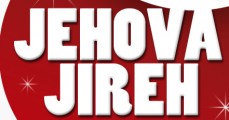
Carattere Identificato: Poplar

Carattere suggerito: Dusty Circus
Thanks!
I know the second line is Avant-Garde but I don't know the logotype.


Carattere Identificato: Serif Gothic Black
The R in Bebas Neue is wrong.

Carattere Identificato: Bebas

Carattere Identificato: Gillies Gothic

Carattere Identificato: Optima

I think this is all in Copperplate, with outline/fill effects on the ANZAC.
Modificato su 19/04/2016 alle 15:42 da frd
Carattere suggerito: Copperplate
Modificato su 19/04/2016 alle 15:42 da frd

Carattere suggerito: Eagle
What isn't working?
"TAMARACK" is also Clearface Heavy.
Fuso orario: CEST. Ora sono le 18:07
