
Forum
617 posts Caratteri Identificati Solo richieste
Posts di notfon1234

This is a 100% exact match.

Modificato su 30/01/2012 alle 01:58 da notfon1234
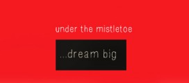
Carattere suggerito: Twentieth Century Medium
Modificato su 30/01/2012 alle 01:58 da notfon1234

Stencil effect was probably used. But this is the font they originally used.
Modificato su 29/01/2012 alle 16:26 da notfon1234
Carattere suggerito: ITC Avant Garde Medium
Modificato su 29/01/2012 alle 16:26 da notfon1234
Try looking here:
http://www.dafont.com/theme.php?cat=603&page=1
http://www.fontsquirrel.com/fonts/list/style/Handdrawn
http://www.dafont.com/theme.php?cat=603&page=1
http://www.fontsquirrel.com/fonts/list/style/Handdrawn
I've had the same problem before too. I never found a solution though.... 


With a modified "S" But definitely Avant Garde. +1


Carattere Identificato: Good Morning Afternoon
Hmm... Interesting. I got Courier.

Modificato su 11/12/2011 alle 04:37 da notfon1234
Modificato su 11/12/2011 alle 04:37 da notfon1234

Carattere Identificato: Creative Block BB Bold
+1 for Avant Garde. Here is an comparison I made using Avant Garde. I cut off part of the "K" and moved the letters closer together.


I think it's this font acctually. Not sure if exact but very close.
http://www.tenbytwenty.com/nevis.php
Modificato su 02/11/2011 alle 02:14 da rocamaco
http://www.tenbytwenty.com/nevis.php
Carattere Identificato: Nevis
Modificato su 02/11/2011 alle 02:14 da rocamaco
yoetrevino ha detto 
IT'S LOOKS LIKE AVENIR FONT
Avenir Std 95 Black
Avenir Std 95 Black
Did you even think to check the font before you suggested? It looks nothing like Avenir...

Modificato 2 volte. Ultima modifica su 02/11/2011 alle 01:38 da notfon1234
Carattere Identificato: Mossy

Carattere suggerito: Agency FB Light

Carattere Identificato: Helvetica Neue Cond Black
Fuso orario: CEST. Ora sono le 03:29
