
Forum
64 posts Caratteri Identificati Solo richieste
Posts di pantextual
Carattere Identificato: Gotham
Carattere suggerito: Lubalin Graph
No, it is; the letters are just distorted in Photoshop. There's consistency between the letterforms, and if you type "THE UNDERACHIEVERS" into Linotype's font tester, you'l see that they're the same.

Carattere suggerito: Smudger

http://www.linotype.com/850/ITCZapfChancery-family.html
Modificato su 29/12/2012 alle 23:58 da rocamaco
Carattere Identificato: Zapf Chancery Italic
Modificato su 29/12/2012 alle 23:58 da rocamaco

No problem, glad to help. 


Carattere Identificato: Ribbon

There are two fonts here; I can't identify the first part of "Daemons," but "MONS" is Myriad Pro Regular.
(And since this was linked to me in French, I'll translate myself: Il y ont deux polices ici ; je ne peux pas identifier la première partie de «Daemons», mais «MONS» est Myriad Pro Regular.)
(And since this was linked to me in French, I'll translate myself: Il y ont deux polices ici ; je ne peux pas identifier la première partie de «Daemons», mais «MONS» est Myriad Pro Regular.)
Carattere suggerito: Myriad Pro

Carattere suggerito: Eurostile

Carattere Identificato: Sofia


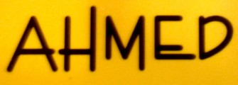
Looks like Nexa, which is similar to Gotham. The R and the apostrophe look more like the ones in Nexa than they do Gotham.
Carattere suggerito: Nexa
I've seen this one used all over the Internet, but I have yet to find out what it's actually *called.*

Looks like it could be Encino; Encino was based on Enviro, but some of the letterforms are different.
Carattere suggerito: Encino

Carattere Identificato: Verlag Condensed

Carattere Identificato: Helvetica Neue
Fuso orario: CEST. Ora sono le 23:28
