
Forum
2.065 posts Caratteri Identificati Solo richieste
Posts di sjh


https://fontsinuse.com/typefaces/13824/apple-chancery
Modificato su 25/04/2024 alle 04:35 da frd
Carattere Identificato: Apple Chancery
Modificato su 25/04/2024 alle 04:35 da frd

Carattere Identificato: Axiforma Bold


Well, i used a graphics program (Adobe Illustrator). You can resize graphics using one of the tools. To get from your sample to what I think was the original for the type, I shrunk it by 40%,, but only its height. No change to the width. So to start from Code Light to match your sample, you would stetch the height (only) by 1/40% = 5/2 = 225% or so. Just note how in the resulting graphic (your sample) the horizontal strokes are wider than the vertical ones. Its not a great look.

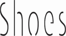
Carattere Identificato: Daydream

I did a vertical compress of about 40%, which rounded out the Q and the C, and revealed Code Light.
Carattere Identificato: Code

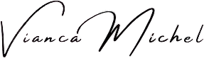
Carattere Identificato: Freshmade Signature
de nada!
Carattere Identificato: Amsterdam Four
Glad I could help.

No prob.
Youre welcome.

Many of the glyphs are alternates from the typeface. You can see them at the MyFonts tester under the ff menu: choose Swash.
Carattere Identificato: Oldskool Script

Most welcome.
Looks like Eurostile Medium for the larger caps. Hard to see for the smaller lower case text.
Modificato su 17/04/2024 alle 03:28 da frd
Carattere Identificato: Eurostile
Modificato su 17/04/2024 alle 03:28 da frd

Offered as SIMILAR, not as an exact match. Its the closest I could get.
Carattere suggerito: Distant Stroke
Fuso orario: CEST. Ora sono le 14:22
