
Forum
28 posts Caratteri Identificati Solo richieste
Posts di ILovePerryMoarThanU1337

Here's a link to MediaFire with both the KCA 2011 and KCA 2012 fonts. I have them and they look pretty close.
Hope it helped,
ILPMTU1337
Hope it helped,
ILPMTU1337
Carattere suggerito: KCA 2011

Naw, I have that font and it's rather disproportionate. But if you're looking for a font that looks more like the real one, here.
Thank you for your time,
I<3Perry
Modificato 2 volte. Ultima modifica su 06/11/2012 alle 16:51 da marty666
Thank you for your time,
I<3Perry
Carattere suggerito: Minecrafter
Modificato 2 volte. Ultima modifica su 06/11/2012 alle 16:51 da marty666
Carattere Identificato: Creative Block BB

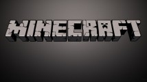
Looks a lot to me like Minecrafter.
Hope it helped,
I<3Perry
Follow me on Twitter! @perryfan1337
Hope it helped,
I<3Perry
Follow me on Twitter! @perryfan1337
Carattere suggerito: MineCrafter
You know the drill by know, do ya? Of course you do. (And not the "The Young People's Channel", I know that's a cheap overlap using Times New Roman, but the "Nickelodeon".) I'm not sure if it's out there or not, but if you do, lemme know, K? K.

Immagine originale: http://images.wikia.com/logopedia/images/7/77/Untitledghth.png
Been searching all over for a font that's similar to this...hope you have it.
EDIT: My bad...If ANYONE, ANYWHERE has it, please help.

Modificato su 30/09/2012 alle 04:42 da ILovePerryMoarThanU1337
EDIT: My bad...If ANYONE, ANYWHERE has it, please help.
Modificato su 30/09/2012 alle 04:42 da ILovePerryMoarThanU1337
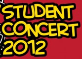
 Title says all...
Fuso orario: CEST. Ora sono le 01:16
