
Forum
3.821 posts Caratteri Identificati
Posts di donshottype

More on the _R_
When the logo was designed the makers were familiar with Souvenir, a serif font created by Morris Fuller Benton in 1914.
The _R_ modification predates a similar revision by George Brian called Souvenir Gothic in 1977 for TypeSpectra [Phil Martins company].
Parallel evolution
Don
When the logo was designed the makers were familiar with Souvenir, a serif font created by Morris Fuller Benton in 1914.
The _R_ modification predates a similar revision by George Brian called Souvenir Gothic in 1977 for TypeSpectra [Phil Martins company].
Parallel evolution

Don

The _R_ is custom, but looks like Souvenir Gothic, digital version by Phil Martin
Don
Don
Carattere suggerito: Souvenir Gothic
The _R_ is custom, but see next post.
_ROLLS ROYCE_ is Gill Sans created by by the British font designer Eric Gill in 1928-32
Don
Modificato su 01/09/2015 alle 00:08 da donshottype
_ROLLS ROYCE_ is Gill Sans created by by the British font designer Eric Gill in 1928-32
Don
Carattere suggerito: Gill Sans
Modificato su 01/09/2015 alle 00:08 da donshottype

Effective lively effect for monoline connecting lettering consisting of straight lines.
However, it would be very difficult to make a connecting script like this because the connecting strokes join the letters at a wide range of angles.
Note how the angle of the stroke leaving _e_ is a perfect match for the upper left segment of the stoke for _c_. But try to join it to another _e_ and there would be a kink at the join. Try a double _e_ or _c_ with _e_. Kinks in every case. The kink is even more abrupt with combinations of the other letters in the sample.
What is possible is something like Master Script which uses the same angle for all connecting strokes and for some portions of letters made from straight lines. The letters are a combination of straight and curved strokes. However Master Script is not a match.
Carattere suggerito: Master Script

Looks like a photo of a store sign.
Coco FY is somewhat similar but far from a match.
Don
Modificato su 30/08/2015 alle 19:11 da donshottype
Coco FY is somewhat similar but far from a match.
Don
Carattere suggerito: Coco
Modificato su 30/08/2015 alle 19:11 da donshottype

Carattere Identificato: Sentinel Black

Carattere Identificato: Machine Medium

Erasmus RR is closer than the other suggested _T_ designs -- note the upward spur on the top serifs.
A design from 1923, which might be the same era as your logo.
Use another font for the _A_ and _C_
Don
A design from 1923, which might be the same era as your logo.
Use another font for the _A_ and _C_
Don
Carattere suggerito: Erasmus
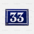
This Didot style of numbers was the basis for a font called Strasse.
"Strasse is modeled after the glazed ceramic tiles commonly used for house numbers throughout Central Europe."
I suspect you will not find anything closer.
Don
Modificato su 29/08/2015 alle 17:31 da donshottype
"Strasse is modeled after the glazed ceramic tiles commonly used for house numbers throughout Central Europe."
I suspect you will not find anything closer.
Don
Carattere suggerito: Strasse
Modificato su 29/08/2015 alle 17:31 da donshottype
You can approximate the _T_ with Hadriano Light. Use another font for the _A_ and _C_
Don
Don
Carattere suggerito: Hadriano Light
The windswept top serifs on the _T_ are a feature found in some early 20th century fonts but I have not spotted an exact match in a digital version.
You can approximate the _T_ with Centaur Bold. Use another font for the _C_
Don
You can approximate the _T_ with Centaur Bold. Use another font for the _C_
Don
Carattere suggerito: Centaur Bold

The original is Rudolf Koch's Neuland.
Many knock-offs perhaps including a damaged version that looks like this.
Fairly straight forward to distress the original and make it yourself.
Don
Many knock-offs perhaps including a damaged version that looks like this.
Fairly straight forward to distress the original and make it yourself.
Don
Carattere suggerito: Neuland


Carattere suggerito: Lucida Calligraphy
Modificato su 29/08/2015 alle 00:59 da donshottype
Missed it.
No need for modification.
Don
Modificato su 28/08/2015 alle 01:59 da donshottype
No need for modification.

Don
Modificato su 28/08/2015 alle 01:59 da donshottype
koeiekat ha detto 
fonatica ha detto
Modified
Modified? Mutilated!
Checkmate

At least it wasn't porno pix
Don
Fuso orario: CEST. Ora sono le 00:52
