
Forum
3.277 posts Caratteri Identificati Solo richieste
Posts di Tomás Silcher


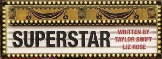
The Fond below in a bit distorted in this image but could be a Helvetica Black.
Carattere suggerito: Helvetica Black

And also one that is a bit more blurred if possible. okthxbai 


Carattere suggerito: DIN Next Heavy Italic
Carattere Identificato: Frutiger Black

Carattere Identificato: ITC Handel Gothic Heavy Italic
Carattere Identificato: Garamond Bold
Carattere Identificato: Helvetica Neue Bold Condensed


Carattere suggerito: Interstate

Carattere Identificato: Gill Sans Light

Carattere Identificato: Zapfino One

Carattere Identificato: Frankfurter Highlight

Carattere Identificato: English 111 Vivace

Carattere suggerito: Eurostile Extended 2

Strange one ... looks like an "Albertus" with extra stroke weight on it. 

Carattere Identificato: Albertus


Note: It's actually lowercase text, not uppercase.
"A" is modified.
"A" is modified.
Carattere Identificato: Neutraface Display Titling

Carattere Identificato: Gotham Light
Fuso orario: CEST. Ora sono le 23:29
