
Forum
3.821 posts Caratteri Identificati
Posts di donshottype


Book cover lettering from 1953 -- an era when hand lettering was being supplanted by photo type.
In either case this looks like condensed lettering perhaps derived from Warren Chappell's Lydian, published by American Type Founders in 1938.
I have not found a digital match to the letters, but there is some similarity to Lydian Bold
In either case this looks like condensed lettering perhaps derived from Warren Chappell's Lydian, published by American Type Founders in 1938.
I have not found a digital match to the letters, but there is some similarity to Lydian Bold
Carattere suggerito: Lydian Bold

STERILIZED UNSWEETENED EVAPORATED MILK resembles LTC Globe Gothic Extra Condensed, based on a design by Morris Fuller Benton, circa 1900.
Carattere suggerito: Globe Gothic Extra Condensed
BESS MILK is hand-lettered.
I have not found a digital font that is a close match.
The rounded serifs and swan-like _S_ are found in Verona TS Bold, which could be edited to make a substitute.
Modificato su 11/04/2016 alle 15:46 da donshottype
I have not found a digital font that is a close match.
The rounded serifs and swan-like _S_ are found in Verona TS Bold, which could be edited to make a substitute.
Carattere suggerito: Verona Bold
Modificato su 11/04/2016 alle 15:46 da donshottype
Good find 


The regular or bold of Ligurino Cond should do the trick. Perhaps with a small additional squeeze in width.
Budget price
Modificato su 10/04/2016 alle 16:55 da donshottype
Budget price

Carattere suggerito: Ligurino Cond
Modificato su 10/04/2016 alle 16:55 da donshottype
I said: "... particularly if the lower rhs is rounded."
I forgot to say the letter is _U_
It should read "...particularly if the lower rhs of _U_ is rounded."
I forgot to say the letter is _U_

It should read "...particularly if the lower rhs of _U_ is rounded."

Carattere Identificato: Tangerine
Modificato 2 volte. Ultima modifica su 10/04/2016 alle 15:47 da fonatica
Looks like hand lettering for _AUTOMATRON_ -- note differences for repeating letters that can not be explained by differences in scale.
EDITED: Elephantmen Tall Bold would work as a substitute, particularly if the lower rhs of _U_ is rounded.
Modificato 2 volte. Ultima modifica su 10/04/2016 alle 15:23 da donshottype
EDITED: Elephantmen Tall Bold would work as a substitute, particularly if the lower rhs of _U_ is rounded.
Carattere suggerito: Elephantmen Tall Bold
Modificato 2 volte. Ultima modifica su 10/04/2016 alle 15:23 da donshottype
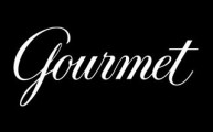
Another script which could be sloped more upright and edited to make a substitute for for _ourmet_ is Classic Script MN
Carattere suggerito: Classic Script
Easier to deal with details using a positive image

Custom logo for a food magazine.
Nothing similar to the _G_
The closest I could find for _ourmet_ is Sonata Pro, which could be sloped more upright and edited to make a substitute
High Def image of the lettering at
https://deliciousdivas.files.wordpress.com/2010/06/9b-apple-cider-glazed-turkey.jpg
Modificato 3 volte. Ultima modifica su 09/04/2016 alle 13:28 da donshottype
Custom logo for a food magazine.
Nothing similar to the _G_
The closest I could find for _ourmet_ is Sonata Pro, which could be sloped more upright and edited to make a substitute
High Def image of the lettering at
https://deliciousdivas.files.wordpress.com/2010/06/9b-apple-cider-glazed-turkey.jpg
Carattere suggerito: Sonata
Modificato 3 volte. Ultima modifica su 09/04/2016 alle 13:28 da donshottype


Carattere suggerito: Smalts

Carattere suggerito: Wilhelm Klingspor Schrift
Carattere suggerito: Wilhelm Klingspor Gotisch
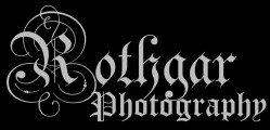
othgar
Also derived from the design known as Teutonic in the 19th century.
Not as wide as Paul Lloyd's version.
Modificato su 08/04/2016 alle 13:09 da donshottype
Also derived from the design known as Teutonic in the 19th century.
Not as wide as Paul Lloyd's version.
Carattere suggerito: Celebration
Modificato su 08/04/2016 alle 13:09 da donshottype
Mellissa Inline is a Letraset font by Douglas Sheldrake from the pre-digital era (1977). The letters, including the swash _T_, match those in my old Product Manual from Letraset.
Don't know of a digital version from a legitimate source.
Modificato su 07/04/2016 alle 14:16 da donshottype

Since my previous post I came across Wall Scrawler.
It could be used as an approximate substitute.
Note that, unlike many comic book fonts, Wall Scrawler has different letters for the upper and lower case letters.
The link shows the lower case in use.
Modificato su 07/04/2016 alle 11:01 da donshottype
It could be used as an approximate substitute.
Note that, unlike many comic book fonts, Wall Scrawler has different letters for the upper and lower case letters.
The link shows the lower case in use.
Carattere suggerito: Wall Scrawler
Modificato su 07/04/2016 alle 11:01 da donshottype
Fuso orario: CEST. Ora sono le 22:51
