
Forum
3.821 posts Caratteri Identificati
Posts di donshottype


Pay version: Waltari
Other names: Joyeuse, Boister Black, Augusta, etc
Modificato su 23/04/2016 alle 14:42 da donshottype
Other names: Joyeuse, Boister Black, Augusta, etc
Carattere suggerito: Waltari
Modificato su 23/04/2016 alle 14:42 da donshottype
Carattere suggerito: Perry Gothic

Carattere Identificato: Cooper Black


The designer of the Chris Craft logo could perhaps have produced this cursive lettering by increasing the slope of Trafton Script, connecting the letters and editing to harmonize. Trafton Script was released by Bauer as Quick in 1933
A digital version is Parfum by Ralph Unger.
Dan X. Solo also produced a digital version of Trafton Script.
Sold on the CD with
_24 Script and Cursive Display Fonts (Dover Electronic Display Fonts) (CD-ROM and Book)_
http://www.amazon.com/Script-Cursive-Display-Electronic-CD-ROM/dp/0486999610/ref=sr_1_2?s=books&ie=UTF8&qid=1461348793&sr=1-2&keywords=24+Script++Fonts+CD-ROM+and+Book+%28Dover+Electronic+Clip+Art%29
Modificato 5 volte. Ultima modifica su 22/04/2016 alle 20:47 da donshottype
A digital version is Parfum by Ralph Unger.
Dan X. Solo also produced a digital version of Trafton Script.
Sold on the CD with
_24 Script and Cursive Display Fonts (Dover Electronic Display Fonts) (CD-ROM and Book)_
http://www.amazon.com/Script-Cursive-Display-Electronic-CD-ROM/dp/0486999610/ref=sr_1_2?s=books&ie=UTF8&qid=1461348793&sr=1-2&keywords=24+Script++Fonts+CD-ROM+and+Book+%28Dover+Electronic+Clip+Art%29
Carattere suggerito: Parfum
Modificato 5 volte. Ultima modifica su 22/04/2016 alle 20:47 da donshottype
From the era when logos were hand lettered. Note the two instances of _C_ and _r_ do not match.
Substitutes are only approximations of this retro script lettering.
The logo set in A&S Valentino Script looks like this

You can try other letters at
http://www.findmyfont.com/index.php/fonts/font-preview?fset=ArtAndSign%20%2F%20%28Commercial%29&ffam=A%26S%20Valentino%20Script%20-%20Regular&fid=f2f4754c9827f3015fccbcfea8232437
Substitutes are only approximations of this retro script lettering.
The logo set in A&S Valentino Script looks like this
You can try other letters at
http://www.findmyfont.com/index.php/fonts/font-preview?fset=ArtAndSign%20%2F%20%28Commercial%29&ffam=A%26S%20Valentino%20Script%20-%20Regular&fid=f2f4754c9827f3015fccbcfea8232437
Carattere suggerito: Valentino Script
Custom blend of Univers 67 (Bold Condensed) and Futura Bold, according to the logo designer, Lindon Leader
See interview with him:
http://www.thesneeze.com/mt-archives/000273.php
Modificato su 22/04/2016 alle 13:03 da donshottype
See interview with him:
http://www.thesneeze.com/mt-archives/000273.php
Modificato su 22/04/2016 alle 13:03 da donshottype
Carattere Identificato: Gabrielle
Carattere Identificato: Park Avenue

Carattere Identificato: Premier Shaded

An Andy Warhol version from the 1960s
https://c1.staticflickr.com/9/8479/8230966079_b9c3c170a4_h.jpg
https://c1.staticflickr.com/9/8479/8230966079_b9c3c170a4_h.jpg
TOMATO is perhaps custom, but compares closely with Graublau Sans Pro Heavy.
Myriad Black and Myriad Black are also close.
Modificato su 20/04/2016 alle 15:27 da donshottype
Myriad Black and Myriad Black are also close.
Carattere suggerito: Graublau Sans Heavy
Modificato su 20/04/2016 alle 15:27 da donshottype
SOUP is hand-lettered from the pre-WWI era and shares features with various fonts from then, such as the swan neck _S_ in Windsor.
Some similarity to Nevada.
Some similarity to Nevada.
Carattere suggerito: Nevada

Carattere suggerito: Walf
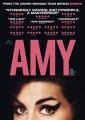
FROM THE ...
AMY - Druk Bold
Modificato 2 volte. Ultima modifica su 19/04/2016 alle 16:05 da frd
AMY - Druk Bold
Carattere suggerito: Druk
Modificato 2 volte. Ultima modifica su 19/04/2016 alle 16:05 da frd
Forgot about that one...
Thanks.
As for Modern Kirchen Gotisch, my experience with other fonts made by Gerhard Helzel is that they are well made.
You have to deal with him direct to purchase his fonts. http://www.fraktur.biz/Index.html
Like Leothric, it's not an exact match to the image, but is of better quality than Fancy Card Text by Becky S.
Modificato su 15/04/2016 alle 21:48 da donshottype
You have to deal with him direct to purchase his fonts. http://www.fraktur.biz/Index.html
Like Leothric, it's not an exact match to the image, but is of better quality than Fancy Card Text by Becky S.
Modificato su 15/04/2016 alle 21:48 da donshottype

If you want the pay version it's called Leothric.
As Claude says, it is better quality than the font in the image.
I agree that Fancy Card Text by Becky S is a match.
IIRC Fancy Card Text was the name used to sell this design in the US in the 19th century.
I don't know if the German version called Moderne Kirchen Gotisch came before or after the US version.
Modificato su 15/04/2016 alle 21:32 da donshottype
As Claude says, it is better quality than the font in the image.
I agree that Fancy Card Text by Becky S is a match.
IIRC Fancy Card Text was the name used to sell this design in the US in the 19th century.
I don't know if the German version called Moderne Kirchen Gotisch came before or after the US version.
Carattere suggerito: Leothric
Modificato su 15/04/2016 alle 21:32 da donshottype
Fuso orario: CEST. Ora sono le 03:01
