
Forum
13.711 posts Caratteri Identificati
Posts di koeiekat

5 full seconds 


Carattere Identificato: Bizarre
Carattere Identificato: Weiss

Carattere Identificato: Source Sans
Carattere Identificato: Amaranth


Carattere Identificato: Didot
The e was apparently not good enough.
Modificato su 25/05/2015 alle 14:38 da koeiekat
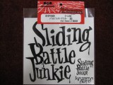
Carattere Identificato: Jungle Juice
Modificato su 25/05/2015 alle 14:38 da koeiekat
 pr
prBut without any doubt made with ...

Before you go any further thinking that what you ask for can be done try to learn/understand something about printing techniques - special digital printing techniques and scalable digital fonts. Then you will understand that today's applications can not do what you have in mind.
Apart from this all, why do you need new character shapes - be it multi-color or monochrome - when you have given proof that your new language can perfectly well use the Latin alphabet?
Apart from this all, why do you need new character shapes - be it multi-color or monochrome - when you have given proof that your new language can perfectly well use the Latin alphabet?

Carattere Identificato: Cabin Sketch
That is one of the many variations of French Script. Which one? Don't know, this one seems to have a round dot on the i which should be a diamond.
Modificato su 26/05/2015 alle 09:54 da drf
Carattere suggerito: French Script
Modificato su 26/05/2015 alle 09:54 da drf

Carattere Identificato: Smack
NYMAREK ha detto 
... Please let us know as we developing a new form of language on earth ...
Looks like you have already done so.
The font is almost one Megabit in size. That in itself could cause problems with some printers. Apart from that, the version here on Dafont has a vertical metrics problem when used with Office on a Mac. I am surprised that Clément has not solved this.

When it is not printing properly, what is actually happening? Is that then also happening with that printer connected to a Windows machine?
Asking because I think it is not a printer or an OS problem but a font problem.
Asking because I think it is not a printer or an OS problem but a font problem.
Carattere Identificato: Caslon Open Face
Fuso orario: CEST. Ora sono le 07:37
