
Forum
3.821 posts Caratteri Identificati
Posts di donshottype


Made by The Works for Copa America with the name Copa America Regular. Not available to the Public.
See larger specimen of some letters at http://www.dafont.com/forum/read/272549/copa-america-centenario-2016-font
See larger specimen of some letters at http://www.dafont.com/forum/read/272549/copa-america-centenario-2016-font
Carattere Identificato: Copa America
Thank you. much appreciated.
It is possible to transform your image into one where the light areas are dark and to produce b&w tiffs that can be auto-traced for further editing. For example a few of the more distinctive glyphs:

[Forgot to include the _Q_ ]
]
The design is attractive and definitely worth pursuing. I think the project would be well worth your effort
Cheers
Modificato 2 volte. Ultima modifica su 12/06/2016 alle 00:22 da donshottype
It is possible to transform your image into one where the light areas are dark and to produce b&w tiffs that can be auto-traced for further editing. For example a few of the more distinctive glyphs:
[Forgot to include the _Q_
 ]
]The design is attractive and definitely worth pursuing. I think the project would be well worth your effort

Cheers
Modificato 2 volte. Ultima modifica su 12/06/2016 alle 00:22 da donshottype
Just for the fun of it, a 50-50 blend of Compacta and Enamel Base

The curves on the top and bottom of letters like _C_ and _O_ look like a really close match to the metal type.
Generally it might be a better match than either font. Unfortunately, AFAIK nobody has produced a font that looks similar to such a blend.
Modificato su 11/06/2016 alle 21:29 da donshottype
The curves on the top and bottom of letters like _C_ and _O_ look like a really close match to the metal type.
Generally it might be a better match than either font. Unfortunately, AFAIK nobody has produced a font that looks similar to such a blend.

Modificato su 11/06/2016 alle 21:29 da donshottype
Neither of the two fonts suggested so far is 100% spot on.
For example, Enamel Base has the closer match for _S_ but Compacta is closer for _G_
etc. etc.
For example, Enamel Base has the closer match for _S_ but Compacta is closer for _G_
etc. etc.

So, seems to be from a French foundry with the name "Tampon"
Some letters, notably _Q_ and _&_ do not seem to match a digital font
Otherwise it looks more or less like Compacta
Modificato su 11/06/2016 alle 18:36 da donshottype
Some letters, notably _Q_ and _&_ do not seem to match a digital font
Otherwise it looks more or less like Compacta
Carattere suggerito: Compacta
Modificato su 11/06/2016 alle 18:36 da donshottype


Is this metal type? wood type?
Any info on foundry?
Any info on foundry?
See also the slightly different New York Magazine logo by George Lois

Modificato su 11/06/2016 alle 11:46 da donshottype
Modificato su 11/06/2016 alle 11:46 da donshottype

Custom design for the merged newspaper of the New York Herald-Tribune, World-Telegram & Sun and Journal-Americans Sunday magazine. When the paper folded it became an independent magazine
A slightly lighter version is still in use at the New York website
The logo was based on Bookman Swash Italic http://www.myfonts.com/fonts/itc/bookman/swash-light-italic/glyphs.html
NOT THE FONT: Bookmania Italic has alternate glyphs which are almost a match to the logo's swash letters
http://www.myfonts.com/fonts/marksimonson/bookmania/italic/glyphs.html
Modificato 5 volte. Ultima modifica su 11/06/2016 alle 14:33 da frd
A slightly lighter version is still in use at the New York website
The logo was based on Bookman Swash Italic http://www.myfonts.com/fonts/itc/bookman/swash-light-italic/glyphs.html
NOT THE FONT: Bookmania Italic has alternate glyphs which are almost a match to the logo's swash letters
http://www.myfonts.com/fonts/marksimonson/bookmania/italic/glyphs.html
Carattere suggerito: Bookmania Italic
Modificato 5 volte. Ultima modifica su 11/06/2016 alle 14:33 da frd

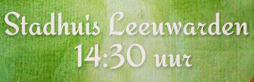
Carattere suggerito: English Script Bold
Modificato 2 volte. Ultima modifica su 10/06/2016 alle 11:57 da frd

Carattere suggerito: Wedding Text
Carattere suggerito: Linotext

Inspired by lettering of the Renaissance lettering master Giovanni Francesco Cresci.
Designers: Richard Dawson and David Farey
Modificato su 09/06/2016 alle 18:23 da donshottype
Designers: Richard Dawson and David Farey
Carattere suggerito: La Gioconda
Modificato su 09/06/2016 alle 18:23 da donshottype

This the logo used since 2012 by Great Dane, a leading manufacturer of semi-trailers.
AFAIK, no exact match to a font available to the public or used on the corporate website.
NOT THE FONT: But there are some similarities in the notched stokes
Modificato 4 volte. Ultima modifica su 09/06/2016 alle 11:29 da donshottype
AFAIK, no exact match to a font available to the public or used on the corporate website.
NOT THE FONT: But there are some similarities in the notched stokes
Carattere suggerito: Serpentine Sans Oblique
Modificato 4 volte. Ultima modifica su 09/06/2016 alle 11:29 da donshottype

Custom logo
However, Aviano Sans can be used as a substitute. The _R_ should be adjusted by raising the midstroke.
However, Aviano Sans can be used as a substitute. The _R_ should be adjusted by raising the midstroke.
Carattere suggerito: Aviano Sans
Fuso orario: CEST. Ora sono le 10:20
