
Forum
393 posts Caratteri Identificati
Posts di conman1985


Roland looks to be set in Univers 53. With possibly a little extra weight added, slightly rounding the edges, likely due to whatever manufacturing process was used to apply the type to the product.
Example, with lower showing extra weight and rounding of edges:
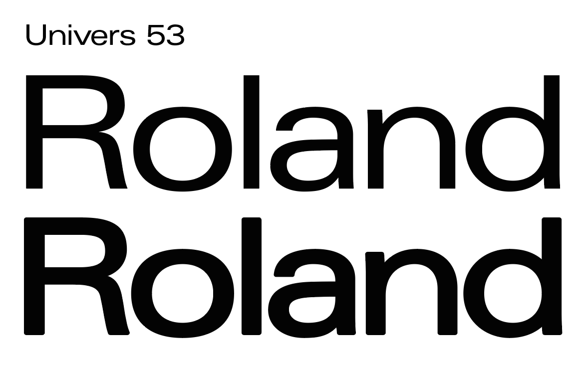
Example, with lower showing extra weight and rounding of edges:
Carattere suggerito: Univers

See Zarana from Compugraphic. Originally named ABC Sans and likely created for the American Broadcasting Company around the mid-1970s. Potentially inspired by Handel Gothic. Saul Bass had previously created a similar look by modifiying Handel Gothic for the 1972 Warner Bros logo.
See ABC Sans here: https://www.instagram.com/p/CnLDhx3NozjbRIfw6xgHszmDhNe8xB2Vy7uw-s0/
1972 Warner Bros. logo: https://www.youtube.com/watch?v=xytHhzNO30Q
Modificato 2 volte. Ultima modifica su 02/05/2024 alle 09:30 da marty666
See ABC Sans here: https://www.instagram.com/p/CnLDhx3NozjbRIfw6xgHszmDhNe8xB2Vy7uw-s0/
1972 Warner Bros. logo: https://www.youtube.com/watch?v=xytHhzNO30Q
Carattere suggerito: Zarana
Modificato 2 volte. Ultima modifica su 02/05/2024 alle 09:30 da marty666
It's custom lettering by Margo Chase. But it may have been loosely based on Caslon Antique, which was used on the cover for Madonna's Remixed Prayers Mini-Album.
Discussion on TypeDrawers:
https://typedrawers.com/discussion/3995/margo-chase-madonna

Modificato su 30/04/2024 alle 15:29 da marty666
Discussion on TypeDrawers:
https://typedrawers.com/discussion/3995/margo-chase-madonna
Modificato su 30/04/2024 alle 15:29 da marty666
It's custom lettering by Margo Chase. But it may have been loosely based on Caslon Antique, which was used on the cover for Madonna's Remixed Prayers Mini-Album.
Discussion on TypeDrawers:
https://typedrawers.com/discussion/3995/margo-chase-madonna
Modificato 2 volte. Ultima modifica su 30/04/2024 alle 15:18 da marty666
Discussion on TypeDrawers:
https://typedrawers.com/discussion/3995/margo-chase-madonna
Modificato 2 volte. Ultima modifica su 30/04/2024 alle 15:18 da marty666


A lot of the iconic 1980s Stephen King book covers use Pacella Latina, a typeface designed by Vincent Pacella for Photo-Lettering, Inc. Trims have been made to the wedge-shaped serifs on some letters for aesthetic reasons or to help tighten the spacing without compromising legibility.
Carattere suggerito: Pacella Latina


A lot of the iconic 1980s Stephen King book covers use Pacella Latina, a typeface designed by Vincent Pacella for Photo-Lettering, Inc. Trims have been made to the wedge-shaped serifs on some letters for aesthetic reasons or to help tighten the spacing without compromising legibility.
Modificato su 31/10/2022 alle 16:17 da conman1985
Carattere suggerito: Pacella Latina
Modificato su 31/10/2022 alle 16:17 da conman1985

"Oxford Films" appears to be Blippo, mostly. See also, the very similar Burko, ITC Bauhaus and Pump.
Modificato su 17/10/2022 alle 10:34 da conman1985
Carattere suggerito: Blippo
Modificato su 17/10/2022 alle 10:34 da conman1985


Update: this has now been solved. It's known as Gemini from Photo-Lettering, Inc.
Carattere Identificato: Gemini

Update: this has now been solved. It's known as Gemini from Photo-Lettering, Inc.
Carattere Identificato: Gemini

Update: this has now been solved. It's known as Gemini from Photo-Lettering, Inc.
Carattere Identificato: Gemini

Update: this has now been solved. It's known as Gemini from Photo-Lettering, Inc.
Carattere Identificato: Gemini
Franklin Gothic. Possibly in a faux italic. Many interpretations, but most digital versions will probably pass as the same. Some versions of it have slightly differently rendered E's and S's.
Carattere Identificato: Franklin Gothic

See Magnetic Ink, a phototype from Photo-Lettering. Available in four weights, with your sample being typeset in one of the heavier. The album's "Space Oddity" type (not featured here) also contains lowercase (see a, c, e, i and t) that match Magnetic Ink. Unfortunately, no digital version.
https://fontsinuse.com/typefaces/115586/magnetic-ink
Compare with type sample (A, E, I, O) featured on the 1974 poster for The Terminal Man:
https://fontsinuse.com/uses/3184/the-terminal-man-1974-movie-poster
Modificato 2 volte. Ultima modifica su 06/04/2022 alle 02:23 da frd
https://fontsinuse.com/typefaces/115586/magnetic-ink
Compare with type sample (A, E, I, O) featured on the 1974 poster for The Terminal Man:
https://fontsinuse.com/uses/3184/the-terminal-man-1974-movie-poster
Carattere suggerito: Magnetic Ink
Modificato 2 volte. Ultima modifica su 06/04/2022 alle 02:23 da frd

Dry transfer lettering from Chartpak named Broken English. Designed by Steven Fabian in 1986, available in 3 weights.
https://fontsinuse.com/typefaces/94233/broken-english
https://fontsinuse.com/uses/25456/nintendo-entertainment-system-consoles-and-co
https://fontsinuse.com/typefaces/94233/broken-english
https://fontsinuse.com/uses/25456/nintendo-entertainment-system-consoles-and-co
Carattere Identificato: Broken English

Also similar:
https://www.myfonts.com/fonts/mika-melvas/handelson/two/
https://www.myfonts.com/fonts/mika-melvas/handelson/two/
Carattere suggerito: Handelson Two
Something similar:
https://www.myfonts.com/fonts/lettersiro/redtowns/regular/
https://www.myfonts.com/fonts/lettersiro/redtowns/regular/
Carattere suggerito: Redtowns
Fuso orario: CEST. Ora sono le 15:17
