
Forum
1.700 carattere identificatos Tutti i post Solo richieste
Caratteri Identificati da sjh


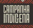
Perhaps a designer replaced the dot in the middle of the O with the diamond shape. Otherwise this matches, including the distressing.
Modificato su 06/11/2023 alle 08:44 da sjh
Carattere Identificato: Le Casino Royale
Modificato su 06/11/2023 alle 08:44 da sjh

Carattere Identificato: Mentra


Carattere Identificato: Thank You
Carattere Identificato: Primma Handmade

The ampersand shown in your sample is a stylistic altenative. It is in the font.
Carattere Identificato: The Wild Things Script

Carattere Identificato: Lubalin Graph Medium

Carattere Identificato: Aguafina Script

The capital S does not come from the font named below. The rest does, to my eye. Let me see if I can track the S down.
Carattere Identificato: Buffalo

Carattere Identificato: Française


Fuso orario: CEST. Ora sono le 11:11
