
Forum
1.205 carattere identificatos Tutti i post
Caratteri Identificati da donshottype


Horizontally compressed and run together. Connecting tail added to _o_
Modificato su 19/04/2017 alle 08:58 da donshottype
Carattere Identificato: Candice
Modificato su 19/04/2017 alle 08:58 da donshottype

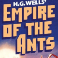
The original is Matthew Carter's Cascade Script
Bitstream calls its version Freehand 471 [already suggested]
Modificato su 18/04/2017 alle 21:40 da donshottype
Bitstream calls its version Freehand 471 [already suggested]
Carattere Identificato: Cascade Script
Modificato su 18/04/2017 alle 21:40 da donshottype

Carattere Identificato: Intelo
ITC Pioneer No. 2 designed by Tom Carnase for ITC in 1970.
The book title uses the phototype era original and slopes the font slightly, does some minor horizontal compression, vertical stretching of _E_ and _A_, and drops the rhs leg of _M_, _R_ and _A_ below the baseline.
The digital version is the same as the phototype era original.
Modificato su 15/04/2017 alle 10:43 da donshottype
The book title uses the phototype era original and slopes the font slightly, does some minor horizontal compression, vertical stretching of _E_ and _A_, and drops the rhs leg of _M_, _R_ and _A_ below the baseline.
The digital version is the same as the phototype era original.
Carattere Identificato: ITC Pioneer
Modificato su 15/04/2017 alle 10:43 da donshottype
The older version, Helvetica Bold, also fits
http://myfonts.us/td-IqMPev
Modificato su 14/04/2017 alle 14:07 da donshottype
http://myfonts.us/td-IqMPev
Carattere Identificato: Helvetica Neue Bold
Modificato su 14/04/2017 alle 14:07 da donshottype

Additional slope applied
Also sold under the name English 111 by Bitstream
Also sold under the name English 111 by Bitstream
Carattere Identificato: Shelley Script

Futura Medium made heavier, with _S_ from another source.
Do not use the ready-made heavier weights. They clip the pointed tips on _M_ and _A_
Do not use the ready-made heavier weights. They clip the pointed tips on _M_ and _A_
Carattere Identificato: Futura Medium

Squeezed in width.
Original name was Profil, a shadowed outline Clarendon from the Photo-Lettering era designed by Eugen and Max Lenz for Edouard Hoffmann (founder of Haas Typefoundry in the 1950s) 1n 1946.
No digital under the name Profil because a font of another design by Linotype is currently assigned the name Profile
Digitized by Bitstream as Decorated 035
More info:
https://fontsinuse.com/typefaces/7262/profil
Carattere Identificato: Decorated 035

There is also a version called Ruben, which looks like a match to _1 DOWN MC ORANGE_

Unfortunately, no legitimate download
Modificato 3 volte. Ultima modifica su 05/04/2017 alle 15:09 da donshottype
Unfortunately, no legitimate download
Carattere Identificato: Ruben
Modificato 3 volte. Ultima modifica su 05/04/2017 alle 15:09 da donshottype

Carattere Identificato: Serpentine Bold Oblique

Carattere Identificato: Compacta Black

Carattere Identificato: Guillemet

Carattere Identificato: Guillemet

Horizontally compressed. Note that the horizontal strokes are thicker than the vertical ones.
Carattere Identificato: Pump Triline
Expanded in width
Modificato su 29/03/2017 alle 21:35 da donshottype
Carattere Identificato: Peignot Bold
Modificato su 29/03/2017 alle 21:35 da donshottype


Carattere Identificato: Wild West

Some squeezing of width noticable for _O_ etc.
See also:
https://fontsinuse.com/uses/6350/the-tonight-show-starring-jimmy-fallon-nbc
See also:
https://fontsinuse.com/uses/6350/the-tonight-show-starring-jimmy-fallon-nbc
Carattere Identificato: Sharp Sans

This ornate Tuscan was designed by Aldo Novarese as Fontanesi
House of Lime's Fontanesi is rough, just like your image.
There is also a cleanly engineered digital version by Nick Curtis. It is found in the lower case of his Kudos Kaps Five NF
http://myfonts.us/td-Gks9Cq
Nick's version omits the middle prongs at the top of the terminals for the arms of the _T_
House of Lime's Fontanesi is rough, just like your image.
There is also a cleanly engineered digital version by Nick Curtis. It is found in the lower case of his Kudos Kaps Five NF
http://myfonts.us/td-Gks9Cq
Nick's version omits the middle prongs at the top of the terminals for the arms of the _T_
Carattere Identificato: Fontanesi

Carattere Identificato: Quarto Bold
Fuso orario: CEST. Ora sono le 17:16
