
Forum
1.205 carattere identificatos Tutti i post
Caratteri Identificati da donshottype


A match, if width is reduced slightly
Modificato su 18/07/2017 alle 22:35 da donshottype
Carattere Identificato: Varsity
Modificato su 18/07/2017 alle 22:35 da donshottype
Carattere Identificato: Raceway

Carattere Identificato: Gotham Ultra

Carattere Identificato: Pluto Bold

A little more research revealed that this pastice of Deco Styles was embodied in a font, Design Fineline, which has been digitized by Steve Jackaman as Xctasy Sans.
Carattere Identificato: Xctasy Sans

Carattere Identificato: Bullet

Carattere Identificato: Serpentine Bold

Edited
The sharp angle leading to the serif terminals on _C_, _G_ and _S_ is converted to a smooth curve.
The leg on _R_ is made more relaxed.
The mid terminal on _G_ is shifted down.
Pointed tips for _A_, _V_ and _N_.
Might be a couple more tweeks that I didn't notice.
Modificato su 09/07/2017 alle 00:42 da donshottype
The sharp angle leading to the serif terminals on _C_, _G_ and _S_ is converted to a smooth curve.
The leg on _R_ is made more relaxed.
The mid terminal on _G_ is shifted down.
Pointed tips for _A_, _V_ and _N_.
Might be a couple more tweeks that I didn't notice.
Carattere Identificato: Chronicle Display Condensed Bold
Modificato su 09/07/2017 alle 00:42 da donshottype

Carattere Identificato: Hobo

Some edits including:
Curl pasted to terminal of _r_
Gap cut in top of _y_ and gap closed near baseline of _y_
Top rhs of _g_ bulged out.
Dot of _i_ made smaller and moved down.
Curl pasted to terminal of _r_
Gap cut in top of _y_ and gap closed near baseline of _y_
Top rhs of _g_ bulged out.
Dot of _i_ made smaller and moved down.
Carattere Identificato: Hansa Gotisch

Carattere Identificato: Blenny

Carattere Identificato: Blenny

Ringlet, a Victorian typeface by Hermann Ihlenburg, 1882

Source: Luc Devroye.
Digitized by Dan X. Solo and included in the CD packaged with the Victorian Aphabets book published by Dover in the 1990s. All letters match your image.
AFAIK, No legitimate download for the Dan X. Solo Ringlet.
Also digitized as Aridi 09
http://www.aridi.com/images/fonts/09.gif
Also digitized by George Williams, eith the name Ringlet, but with a different _n_ than the one shown in your image.
More info:
https://fontsinuse.com/typefaces/7581/ringlet
Modificato 5 volte. Ultima modifica su 03/07/2017 alle 21:26 da donshottype
Source: Luc Devroye.
Digitized by Dan X. Solo and included in the CD packaged with the Victorian Aphabets book published by Dover in the 1990s. All letters match your image.
AFAIK, No legitimate download for the Dan X. Solo Ringlet.
Also digitized as Aridi 09
http://www.aridi.com/images/fonts/09.gif
Also digitized by George Williams, eith the name Ringlet, but with a different _n_ than the one shown in your image.
More info:
https://fontsinuse.com/typefaces/7581/ringlet
Carattere Identificato: Ringlet
Modificato 5 volte. Ultima modifica su 03/07/2017 alle 21:26 da donshottype

Carattere Identificato: Premier Shaded

Carattere Identificato: Playbill

Carattere Identificato: Korinna

1. The _F_ is rotated counterclockwise
2. Alternate _l_
http://www.myfonts.com/fonts/fenotype/salamander/regular/glyphs.html#glyphs/566437/149
2. Alternate _l_
http://www.myfonts.com/fonts/fenotype/salamander/regular/glyphs.html#glyphs/566437/149
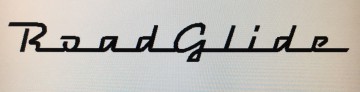
Carattere Identificato: Salamander Script

Expanded horizontally, which produces the thicker vertical strokes and the increased slope.
Carattere Identificato: City Bold Italic

Carattere Identificato: Cooper Black Italic
Fuso orario: CEST. Ora sono le 03:49
