
Forum
1.205 carattere identificatos Tutti i post
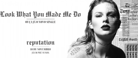
Caratteri Identificati da donshottype


Carattere Identificato: Bodoni Poster Compressed

Carattere Identificato: Moderne Fraktur

High res image of this sign:

AG Old Face Pro Bold, thickened by signmaker.
Modificato 4 volte. Ultima modifica su 12/09/2017 alle 05:21 da donshottype
AG Old Face Pro Bold, thickened by signmaker.
Carattere Identificato: AG Old Face Pro Bold
Modificato 4 volte. Ultima modifica su 12/09/2017 alle 05:21 da donshottype

Format is Photoshop template file.
Modificato 4 volte. Ultima modifica su 08/09/2017 alle 14:07 da donshottype
Carattere Identificato: Cursive Neon Type
Modificato 4 volte. Ultima modifica su 08/09/2017 alle 14:07 da donshottype

Carattere Identificato: Blippo

The user is expected to use the stamp letters so that they line up like a standard font. See the top of the box shown in the lower half of the image.
This is Morris Fuller Benton's Century Schoolbook, created for American Type Founders, 1915-1923.
It has a condensed uppercase that matches the one found in Paratype's version of Century Schoolbook. For the lowercase use the regular width.
Modificato su 07/09/2017 alle 13:57 da donshottype
This is Morris Fuller Benton's Century Schoolbook, created for American Type Founders, 1915-1923.
It has a condensed uppercase that matches the one found in Paratype's version of Century Schoolbook. For the lowercase use the regular width.
Carattere Identificato: SchoolBook
Modificato su 07/09/2017 alle 13:57 da donshottype

Carattere Identificato: Selfie

Carattere Identificato: Blippo

Carattere Identificato: Old English Text
Carattere Identificato: Engravers Old English

Swash bottom of _T_ is custom. Looks like mirror of swash bottom of _M_
Carattere Identificato: LHF Elixir

Carattere Identificato: Franklin Gothic

Berthold's London Text, with fill deleted

Does not seem to be a current legitimate source for purchase.
p.s. OPTI's Leon Text is similar, but has differences such as the location of the hairline between the top terminal and the lhs stroke of _a_
Does not seem to be a current legitimate source for purchase.
p.s. OPTI's Leon Text is similar, but has differences such as the location of the hairline between the top terminal and the lhs stroke of _a_
Carattere Identificato: London Text

Carattere Identificato: Blade Runner Movie Font

Carattere Identificato: Korinna

Hoefler & Co created a font to match the numbers in U.S. currency.
Note that the Hoefler webpage for Numbers Greenback says:
"Hoefler & Co. has refrained from giving Greenback a companion alphabet, to avoid tempting would-be counterfeiters "
For the _G_ you will have to rely on an approximate substitute. Check out this monospaced DIN:
https://www.myfonts.com/fonts/parachute/pf-din-mono/
Carattere Identificato: Numbers Greenback

In the predigital era this was called Putty
https://www.flickr.com/photos/stewf/32483252291/
Modificato su 30/08/2017 alle 08:27 da donshottype
https://www.flickr.com/photos/stewf/32483252291/
Carattere Identificato: Janice
Modificato su 30/08/2017 alle 08:27 da donshottype

Horizontally compressed and new texture to make HICKOK title.
Carattere Identificato: Press Style Large

Ariston Bold or Extra Bold, sloped by user leftwards to upright alignment
Carattere Identificato: Ariston
Fuso orario: CEST. Ora sono le 09:15
