
Forum
3 posts
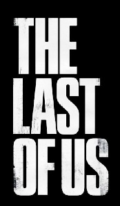
The Last of Us
The Last of Us
Tungsten Suggeriti da donshottype
Press Gothic Suggeriti da donshottype
Caratteri suggeriti
Tungsten Suggeriti da donshottype
Press Gothic Suggeriti da donshottype

Perhaps made from mixing the heavier weights of Tungsten Narrow and editing.
Here is a custom intermediate weight slightly closer to black than to bold, with width reduced to 84% and negative vertical bolding of 12 to a version scalled to an X height of 700.
Converted to negative to facilitate comparison with your image.

Pretty close to the letters in the image.
Modificato 2 volte. Ultima modifica su 17/06/2017 alle 17:52 da donshottype
Here is a custom intermediate weight slightly closer to black than to bold, with width reduced to 84% and negative vertical bolding of 12 to a version scalled to an X height of 700.
Converted to negative to facilitate comparison with your image.
Pretty close to the letters in the image.
Carattere suggerito: Tungsten
Modificato 2 volte. Ultima modifica su 17/06/2017 alle 17:52 da donshottype
Press Gothic is too wide and the counters too open, but could otherwise be used as an approximate substitute.
Carattere suggerito: Press Gothic
Fuso orario: CEST. Ora sono le 00:45
