

Forum
29 posts
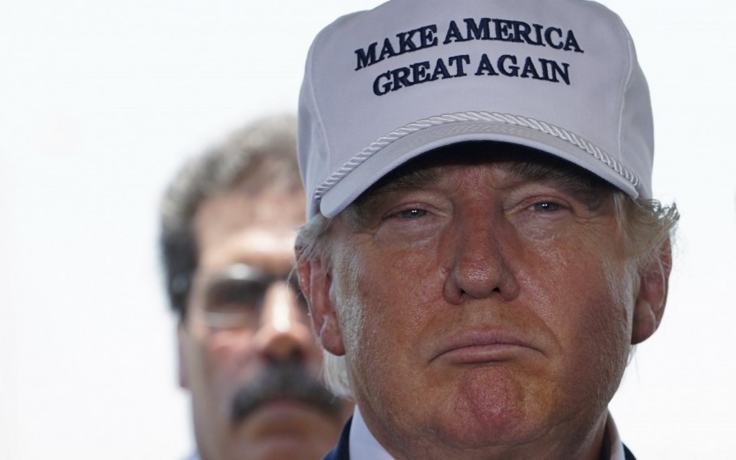
Donald Trump Make America Great Again Hat Font
Can anyone identify the font used on this hat?
Thank you!
Bookman Demi Suggeriti da Roadweiler
Times New Roman Suggeriti da Baki the Builder
Vinegar Suggeriti da Bozac
Marion Suggeriti da slevangie
Georgia Suggeriti da What?
Humanist/Old Style Suggeriti da Gonzo Far
Garamond Suggeriti da Greenhat
American Typewriter Suggeriti da crazyredargyle
Times Bold Suggeriti da stewf
Hellas Times Suggeriti da toomanyfonts
Century Suggeriti da nottimesnewroman
Thank you!
Caratteri suggeriti
Bookman Demi Suggeriti da Roadweiler
Times New Roman Suggeriti da Baki the Builder
Vinegar Suggeriti da Bozac
Marion Suggeriti da slevangie
Georgia Suggeriti da What?
Humanist/Old Style Suggeriti da Gonzo Far
Garamond Suggeriti da Greenhat
American Typewriter Suggeriti da crazyredargyle
Times Bold Suggeriti da stewf
Hellas Times Suggeriti da toomanyfonts
Century Suggeriti da nottimesnewroman
anyone know?

Carattere suggerito: Times New Roman
This is the closest match I can find. (I know i'm a little late.)
Carattere suggerito: Vinegar

The cap lettering came up several times in this forum and nothing was decided
As I said last time about Times New Roman [TNR] -- which I suggested then:
[http://www.dafont.com/forum/read/275707/make-america-great-again-trump-cap]
The first _G_ is serifless on the lower rhs [like TNR], the second _G_ has a serif. So not a font?
But compare with Donald Trump's trademark application for the word mark MAKE-AMERICA-GREAT-AGAIN
http://www.trademarkologist.com/files/2016/05/MAKE-AMERICA-GREAT-AGAIN-page.jpg
Perhaps the hat maker is producing a garbled version of TNR?
Well based on the hat over all I would select Vinegar over NTR.
Over all, the embroidery on the hat is very poor, and I would suspect that the stitch count was low when they digitized it. So theres that to consider too. (based on looking at a hot on Trump's offical merch site)
Modificato 3 volte. Ultima modifica su 27/07/2016 alle 21:28 da Bozac
Over all, the embroidery on the hat is very poor, and I would suspect that the stitch count was low when they digitized it. So theres that to consider too. (based on looking at a hot on Trump's offical merch site)
Modificato 3 volte. Ultima modifica su 27/07/2016 alle 21:28 da Bozac

Bozac - take a look at the cap R - it's Times Roman.
And yes, the reason it does not look like a font -- is because it is embroidered.
Modificato su 27/07/2016 alle 22:11 da Heron2001
And yes, the reason it does not look like a font -- is because it is embroidered.
Modificato su 27/07/2016 alle 22:11 da Heron2001

The short middle bar of the E makes Times or Times New Roman unlikely. Times Bold is possible.
Carattere suggerito: Times Bold
But the artwork for this hat is really a mess all around. The first G has no beard but the second does. Which is also true of the hats they sell on the Trump website.
Modificato 2 volte. Ultima modifica su 12/09/2016 alle 10:20 da frd
Modificato 2 volte. Ultima modifica su 12/09/2016 alle 10:20 da frd
YOU ARE ALL WRONG.... NOT EVEN CLOSE. times new roman hahahahahahahah
IT is CLEARLLLLY some type of *CENTURY font COME ON PEOPLE times new roman hahahahahahahahahahahahahah
IT is CLEARLLLLY some type of *CENTURY font COME ON PEOPLE times new roman hahahahahahahahahahahahahah
Carattere suggerito: Century
I believe it's actually HellasTimes bold
Modificato su 18/11/2016 alle 18:51 da frd
Carattere suggerito: Hellas Times
Modificato su 18/11/2016 alle 18:51 da frd
I'm pretty sure it's just American Typewriter. A font called "Typerwriter" is a stock font for basically every embroiderer.
Carattere suggerito: American Typewriter
It's my a**! He's pres now no more hats! 


If you look at the downward diagonal stroke of the letter 'R' you see it's straight, not curved. That rules out Century entirely (ha ha). If you look at the crossbar on the A, it's really higher that Times New Roman's. If you look at the crossbar of the E, the hat's is not centered on the Y axis, but in Times and TNR they both are. I don't think it's either of those. It most certainly isn't American typewriter, since the hat has differences in stroke width, while AT doesn't..
I believe it is Humanist/Old Style
Carattere suggerito: Humanist/Old Style
Our embroidery machine has custom fonts that emulate popular fonts such as Times New Roman - I suspect that this is an embroidery only font that is built into digitizing/embroidery software
Its likely Russ Times, which is an tagima embroidery only font, other than the second G... I dont know what twit set that up.
I was looking for this same information to customize my own maga hat (I don't like the Trump cap style) and on a hat customization site the font that matched 100% as far as I can tell is "Garmond"
Registered just to say that. Seems like trump uses a cheap factory. Also I have a friend who's mom owns an embroidery shop and she say's that the embroidery machines use compatible clip art instead of standard fronts so this could still be an image version of tnr. She said it looked like an imaged version of ITC Bookman while her son said it looked like a custom clarendon. Imma go with garmond since it is the closest on the hat site even though the G and the E are slightly different. Most people wouldn't be able to see any difference.
Registered just to say that. Seems like trump uses a cheap factory. Also I have a friend who's mom owns an embroidery shop and she say's that the embroidery machines use compatible clip art instead of standard fronts so this could still be an image version of tnr. She said it looked like an imaged version of ITC Bookman while her son said it looked like a custom clarendon. Imma go with garmond since it is the closest on the hat site even though the G and the E are slightly different. Most people wouldn't be able to see any difference.
Carattere suggerito: Garamond
Greenhat ha detto
I was looking for this same information to customize my own maga hat (I don't like the Trump cap style) and on a hat customization site the font that matched 100% as far as I can tell is "Garmond"
Registered just to say that. Seems like trump uses a cheap factory. Also I have a friend who's mom owns an embroidery shop and she say's that the embroidery machines use compatible clip art instead of standard fronts so this could still be an image version of tnr. She said it looked like an imaged version of ITC Bookman while her son said it looked like a custom clarendon. Imma go with garmond since it is the closest on the hat site even though the G and the E are slightly different. Most people wouldn't be able to see any difference.
Garmond
Hey you seem like you are a big fan of the president. I think MAGA hats are pretty cool but if you want to get the full POTUS look you should get a presidential seal embroidery badge. Just like the one Donald wears on his
windbreaker jacket. You can find it on eBay and it is Indeed made in the USA - how do I know? I replicated them. You can support the US jobs and members of this forum by purchasing from a member like me!
Modificato su 14/10/2018 alle 11:41 da marty666
The first G is a sewing error but everything else is BOOKMAN DEMI. Take a look at the E and the T in particular.
This image alone isn't the best, but you can Google a few others to compare.
This image alone isn't the best, but you can Google a few others to compare.
Carattere suggerito: Bookman Demi
Fuso orario: CEST. Ora sono le 07:18
