
Forum
4 posts
Minute Maid font please

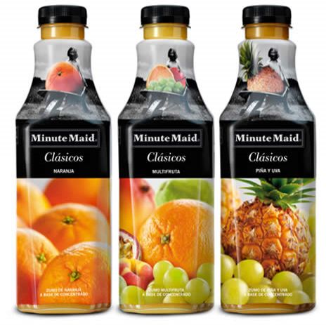
I used this for reference:
http://1.bp.blogspot.com/_UZImdYAiry8/TTaiL1gZ_2I/AAAAAAAAVac/uC0U1nnEtHw/s1600/minute_maid.jpg
It looks like a customized version of CA Texteron Heavy. The "i", "t" and "n" are somewhat different, but the "M" and "u" are almost exactly the same (apart from the "hollow" effect obviously). Overall the serifs have been rounded a bit.
Modificato su 16/08/2011 alle 23:15 da aajohan
http://1.bp.blogspot.com/_UZImdYAiry8/TTaiL1gZ_2I/AAAAAAAAVac/uC0U1nnEtHw/s1600/minute_maid.jpg
It looks like a customized version of CA Texteron Heavy. The "i", "t" and "n" are somewhat different, but the "M" and "u" are almost exactly the same (apart from the "hollow" effect obviously). Overall the serifs have been rounded a bit.
Carattere suggerito: CA Texteron Heavy
Modificato su 16/08/2011 alle 23:15 da aajohan

Aajohan, you used a new logo, dafont4all needs old logo I think.
SashiX ha detto 
Aajohan, you used a new logo, dafont4all needs old logo I think.
Yeah correct^^
Fuso orario: CEST. Ora sono le 08:45
