Pubblicità di ingoFonts
Econo Sans
Econo Sans di ingoFonts 
in Basico > Sans serif
5.603 scaricati (5 ieri) Gratis per uso personale - 56 file dei caratteri
EconoSansReduced-35Thin.ttfEconoSansReduced-45Light.ttfEconoSansReduced-55Book.ttfEconoSansReduced-65Medium.ttfEconoSansReduced-75Bold.ttfEconoSansReduced-85Heavy.ttfEconoSansReduced-95Black.ttfEconoSansReduced-36ThinItalic.ttfEconoSansReduced-46LightItalic.ttfEconoSansReduced-56Italic.ttfEconoSansReduced-66MediumItalic.ttfEconoSansReduced-76BoldItalic.ttfEconoSansReduced-86HeavyItalic.ttfEconoSansReduced-96BlackItalic.ttfEconoSansReduced-33ThinExpanded.ttfEconoSansReduced-43LightExpanded.ttfEconoSansReduced-53BookExpanded.ttfEconoSansReduced-63MediumExpanded.ttfEconoSansReduced-73BoldExpanded.ttfEconoSansReduced-83HeavyExpanded.ttfEconoSansReduced-93BlackExpanded.ttfEconoSansReduced-34ThinExpandedItalic.ttfEconoSansReduced-44LightExpandedItalic.ttfEconoSansReduced-54BookExpandedItalic.ttfEconoSansReduced-64MediumExpandedItalic.ttfEconoSansReduced-74BoldExpandedItalic.ttfEconoSansReduced-84HeavyExpandedItalic.ttfEconoSansReduced-94BlackExpandedItalic.ttfNote dell'autore
The most space-saving sans serif
Even the name of the font implies its function: French for the infinitive “to save” is “économiser.” Now if that doesn’t sound good…
This font saves more space
than any of its kind!
Slim proportions,
but not “condensed”
Characters which nearly touch
Sparse ascenders and descenders
Distinct forms
How close to each other can the characters of a font get? Theoretically, as close as you want. But obviously, the words should still be legible. And as any designer knows, body clearance of characters also depends on other parameters such as point size and line spacing.
In practice, there are always situations in which as much information as possible has to be positioned in as little space as possible.
The ingoFont ÉconoSans is made for exactly this purpose.
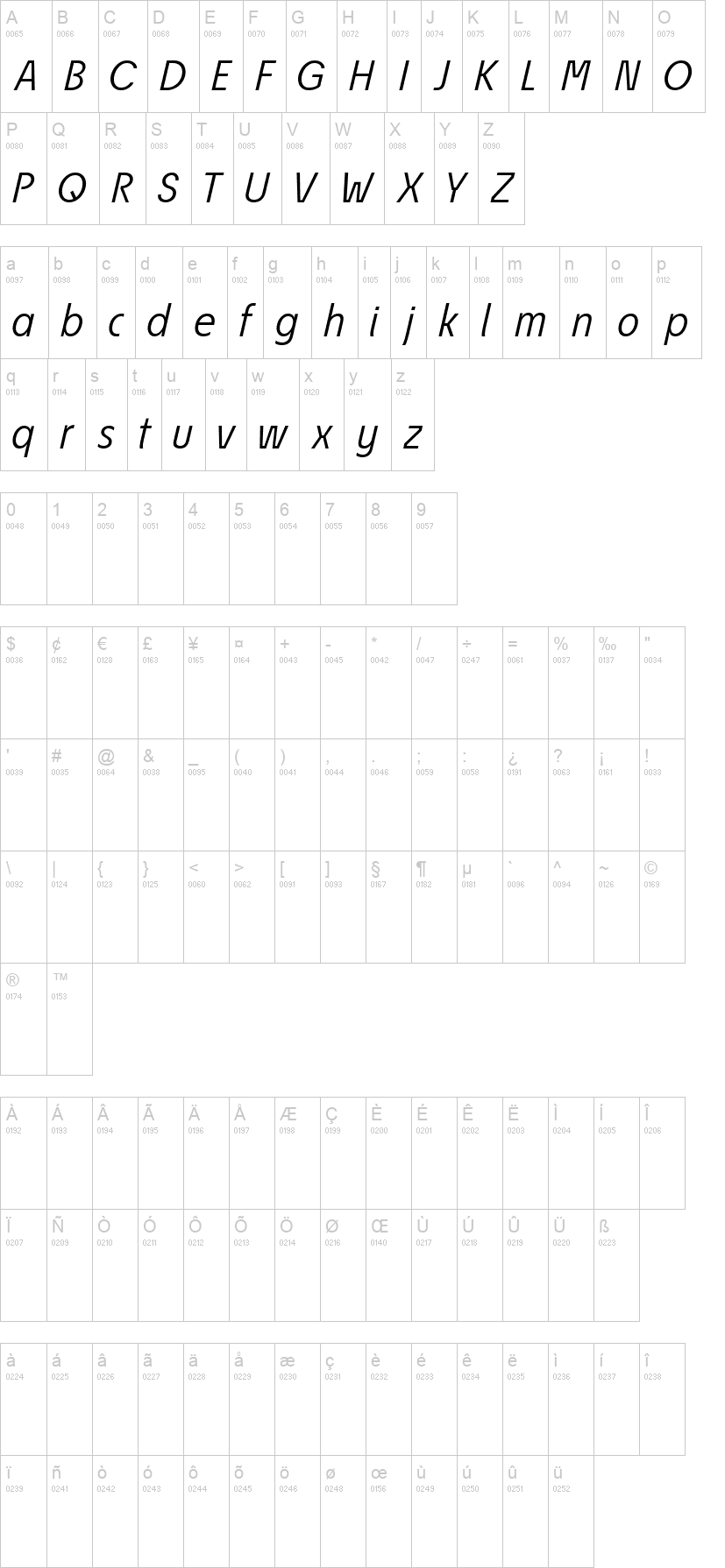
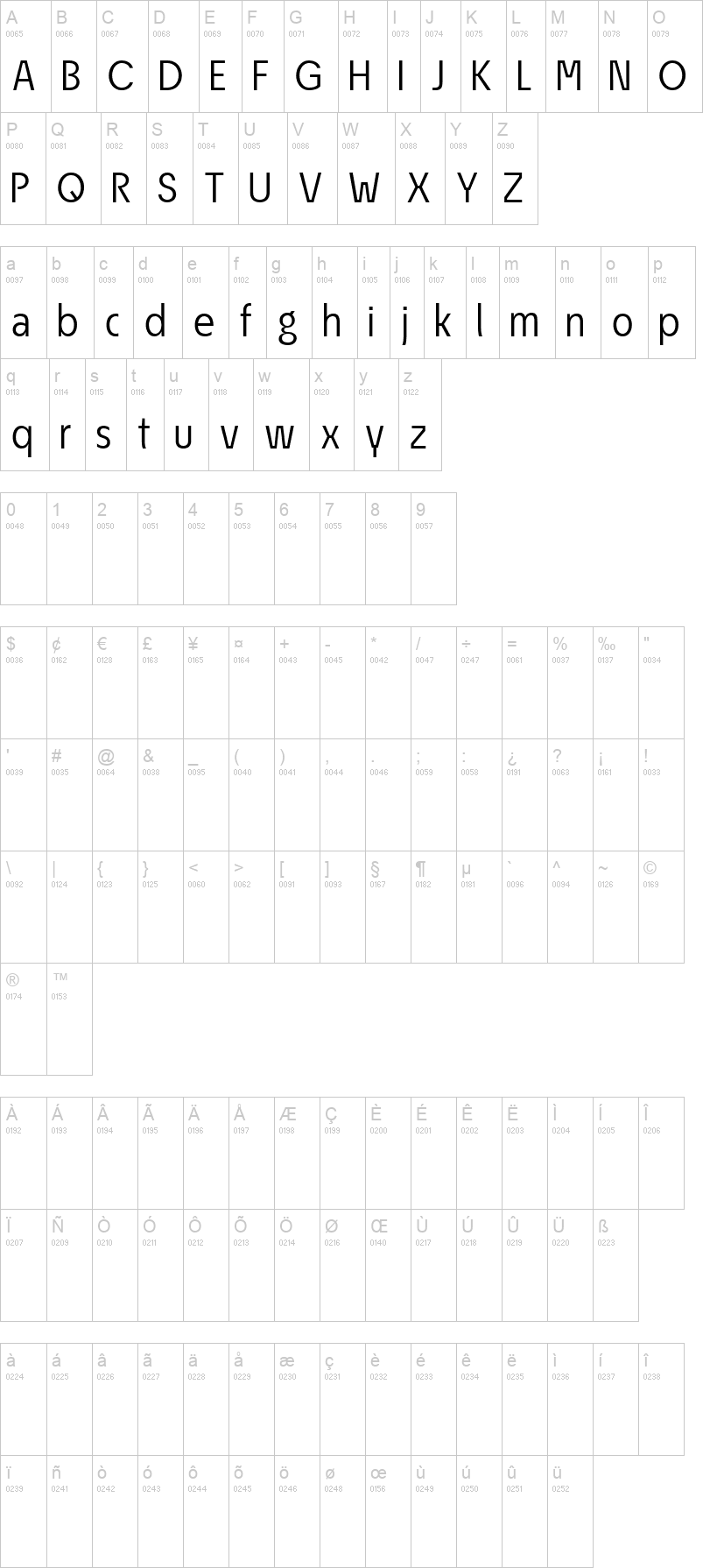
The shapes of the upper and lower case letters are completely matter-of-fact, the way a modern font has got to be. The letters c, e, and s are wide open to their neighbors. An especially distinguished trait of this font is the design of the “triangular” characters v, w, y, x, k, z and A, V, W, Y, Z, K, X, M, N. And the open form of B, R and P is also not typical in a sans serif.
The distance between letters is kept tight and often the characters nearly touch, but only nearly.
Results of a comparison*: With ÉconoSans you gain approximately 20% more text in a line than with Tahoma, and even still more than 10% compared to Helvetica Neue, not to mention the old “normal” Helvetica…
* In order to truly compare, the fonts were measured up to the same visual size, i.e. ÉconoSans 12 pts, Avenir Next 12.5 pts, Bell Centennial 12.5 pts, Helvetica 11 pts, Tahoma 11 pts. Altro...
Even the name of the font implies its function: French for the infinitive “to save” is “économiser.” Now if that doesn’t sound good…
This font saves more space
than any of its kind!
Slim proportions,
but not “condensed”
Characters which nearly touch
Sparse ascenders and descenders
Distinct forms
How close to each other can the characters of a font get? Theoretically, as close as you want. But obviously, the words should still be legible. And as any designer knows, body clearance of characters also depends on other parameters such as point size and line spacing.
In practice, there are always situations in which as much information as possible has to be positioned in as little space as possible.
The ingoFont ÉconoSans is made for exactly this purpose.
The shapes of the upper and lower case letters are completely matter-of-fact, the way a modern font has got to be. The letters c, e, and s are wide open to their neighbors. An especially distinguished trait of this font is the design of the “triangular” characters v, w, y, x, k, z and A, V, W, Y, Z, K, X, M, N. And the open form of B, R and P is also not typical in a sans serif.
The distance between letters is kept tight and often the characters nearly touch, but only nearly.
Results of a comparison*: With ÉconoSans you gain approximately 20% more text in a line than with Tahoma, and even still more than 10% compared to Helvetica Neue, not to mention the old “normal” Helvetica…
* In order to truly compare, the fonts were measured up to the same visual size, i.e. ÉconoSans 12 pts, Avenir Next 12.5 pts, Bell Centennial 12.5 pts, Helvetica 11 pts, Tahoma 11 pts. Altro...
Visto per la prima volta su DaFont: 19/09/2022

EconoSansReduced-55Book.ttf
EconoSansReduced-56Italic.ttf