Bounce
Bounce di Ryan Maelhorn
Bounce.otfNote dell'autore
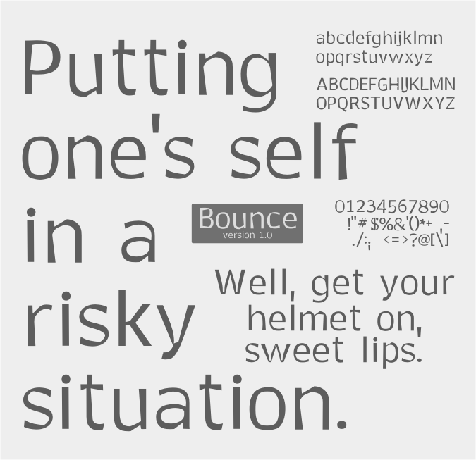
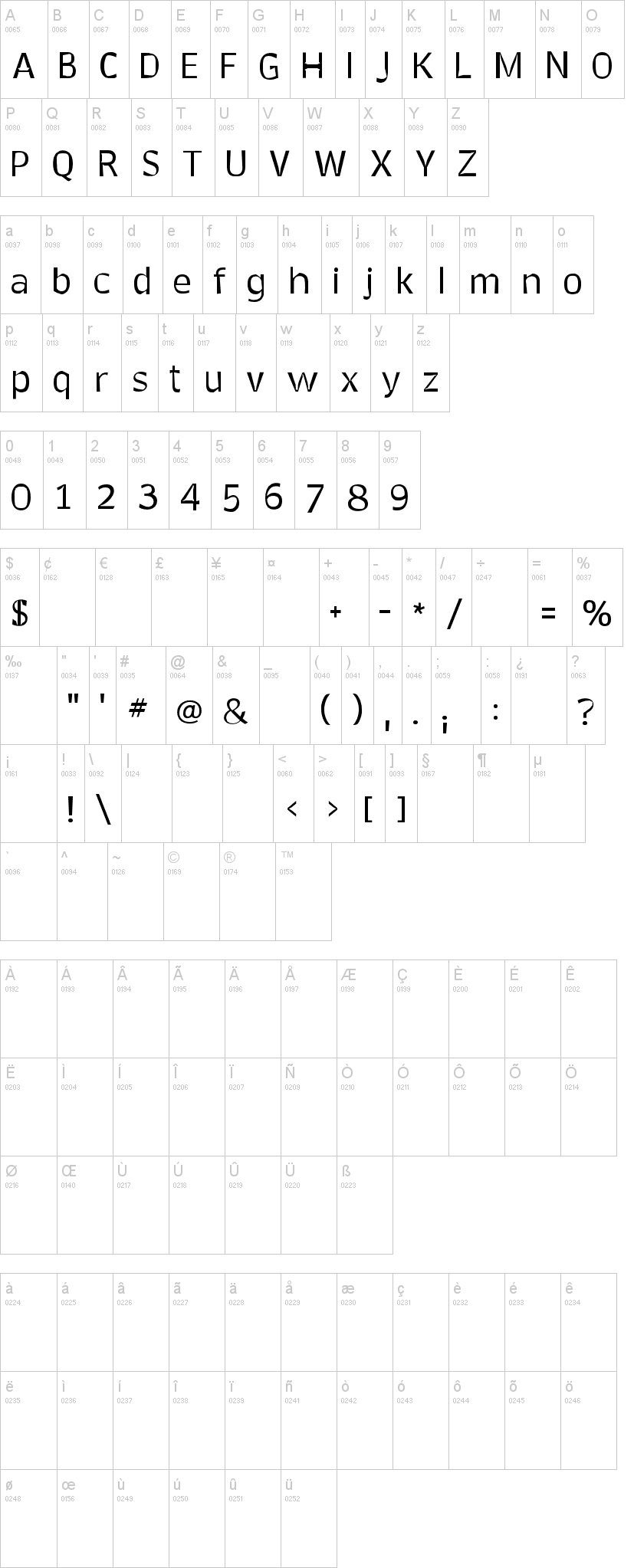
Bounce maintains an overall stroke balance from glyph to glyph, yet still manages to be packed full of extreme width differences. Every glyph has a thinner form tying into a bigger, thicker, or if you like, bolder stroke, and not just a little bit bolder. On top of that Bounce is incredibly readable, down to 4 point. The overall tone and color of the text set in Bounce will appear even, and yet you won't be able to help but notice it is full of flavor.
Visto per la prima volta su DaFont: 08/04/2012


