3x5
94.283 scaricati (3 ieri) Gratis per uso personale - 2 file dei caratteri
3x5.otf3x5Outline.otfNote dell'autore
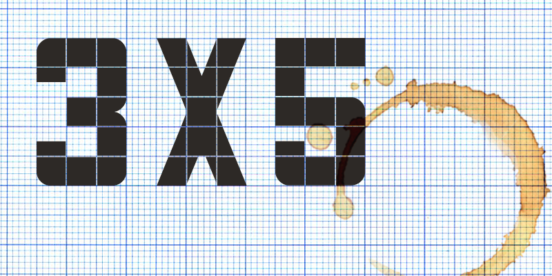
3×5 and 3×5 Outline are All-Caps display fonts rooted in a simple but distinctive grid logic: most characters are constructed within a framework three squares wide by five squares tall. Their origins lie in the squared, hand-drawn lettering once used on art folders at the former Joseph Eastham High School in Salford, where letters were carefully plotted on 1cm graph paper. In these digital interpretations, that underlying structure is not hidden but celebrated; the square modules and internal divisions remain visible, forming a defining decorative feature of each character.
The result is a pair of typefaces that feel both utilitarian and expressive. There is a quiet honesty to their construction, echoing an era when lettering was measured, marked out, and made by hand. At the same time, the rigid grid lends a subtle rhythm and consistency across words, giving text a cohesive, almost architectural quality.
3×5 carries a solid, confident presence, while 3×5 Outline offers a lighter, more open counterpart. Both fonts evoke the tiled and modular lettering found in mid-century public spaces such as railway stations, swimming baths, school corridors, and civic buildings, where durability and clarity were paramount. This association lends them a gentle note of nostalgia without tying them to any single period style.
Highly legible and visually striking, the fonts are well suited to sports branding, poster design, signage, and merchandise, where boldness and clarity are essential. Version 4.0 (2026) introduces refined outlines and improved consistency.
Both fonts are free for personal use.
Visto per la prima volta su DaFont: 13/10/2005 - Aggiornato: 15/05/2026