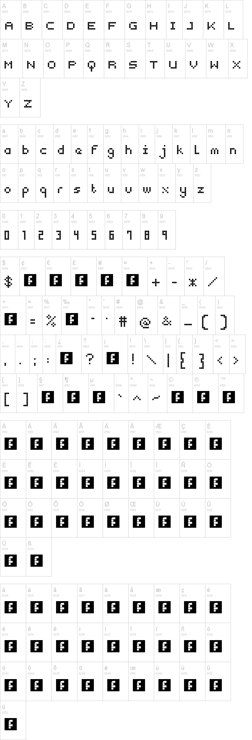
Snap 2 Grid
Snap 2 Grid par Type Generator
9 469 téléchargements Gratuit pour un usage personnel
snap_2_grid.ttfNote de l'auteur
The idea of designing typefaces is to enhance
how a message is communicated. The idea
for Snap 2 Grid was to use simple square
shapes on a square grid.It is a visualisation
of a chocolate typeface designed for brand
identity and advertising but also to bring
appeal to the design process. The objective
was to simplify the process of type design
down to almost child-like building blocks yet
keeping the technical appearance of a grid.
Experimentation can be very important
in the development of ideas. Sketching,
observing and building 2D and 3D forms can
help the design process along. Snap 2 Grid
begun with cardboard blocks with magnets
attached that could stick to a refridgerator.
This brings back ideas of baby building
blocks and early learning and has lead to
the modular letter shapes of the Snap 2 Grid
display Typeface.
Mise en ligne sur DaFont : 28/02/2011


