
 English
  Français
  Español
  Deutsch
  Italiano
  Português
Forum
60 posts Polices identifiées
Posts par Chirico


Scratchy fonts like Menhir suggested will also look nice too. It just depends on the mood you want.
Did you already go to the font identification forum?
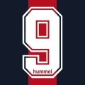


The Futura family was used for all the fonts on the poster.
Édité le 21/07/2015 à 04:54 par Chirico
Police identifiée : Futura
Édité le 21/07/2015 à 04:54 par Chirico
I know it doesn't look like exactly like Slant, but this is the closest you'll get to having the Black Eyed Peas' font. The one in the picture is truly a polished up version of Slant if you look closely. As I said, this is a custom, unreleased font, so Slant is as good as it will get for now. Sorry.
Édité 2 fois. Dernière édition le 21/07/2015 à 04:40 par Chirico
Édité 2 fois. Dernière édition le 21/07/2015 à 04:40 par Chirico

Police suggérée : EB Garamond
Amperstand is from Chasseur BQ Regular.
Everything else is Garamond.
Édité le 21/07/2015 à 02:27 par Chirico
Everything else is Garamond.
Police suggérée : Chasseur
Édité le 21/07/2015 à 02:27 par Chirico

"Cut-out" fonts can look akin to rough tree/stone carving and add a certain playfulness. I would recommend Cutting Corners.
http://www.1001fonts.com/cutting-corners-font.html
Édité le 21/07/2015 à 06:52 par Chirico
http://www.1001fonts.com/cutting-corners-font.html
Édité le 21/07/2015 à 06:52 par Chirico
I would try using a different browser and seeing if the tryout text loads up. The kind of browser you use can most definitely alter the way you see text on a page.

Ice Kingdom.
Police suggérée : Ice Kingdom
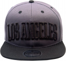
Player Pro Condensed.
And if you would rather have a similar one, try College Condensed (uppercase for slabs).
And if you would rather have a similar one, try College Condensed (uppercase for slabs).
Police suggérée : Player Condensed
It could very well be based off of that font, however, the character would have been extremely edited to create that logo. Obviously there are lots of cosmetic changes, but there are all many character design changes too, such the degree of roundness at the front, the inflection of at the top, etc.
This font is very similar though and is great for any sort of sports-related project. You might have to just use the one you found as I am still very doubtful any sort of type like your picture actually exists.
This font is very similar though and is great for any sort of sports-related project. You might have to just use the one you found as I am still very doubtful any sort of type like your picture actually exists.

I do doubt that it could be a font since custom, unreleased-to-the-public, brush characters are very often used for albums these days. Meaning, it is possible that those letters where made specifically for album and do not actually exist as part of a font family.
I could indeed be wrong and one of our font experts on here may find it eventually. I strongly doubt it though.
I could indeed be wrong and one of our font experts on here may find it eventually. I strongly doubt it though.

To date, the Quiznos font was custom made by the company so there is no known Quiznos typefamily floating around. The closet to the font would probably be Warlock Heavy, though the top serifs are inverted and the caps are different. Sorry.
Police suggérée : Warlock Heavy
Fuseau horaire : CEST. Il est actuellement 11:20
