
Forum
13 590 posts Polices identifiées Requêtes seulement
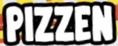
Posts par Heron2001

Morning Marty - thank you for writing the Q doesn't match, because you know as part of my continuing education, I would have written you as to what you thought wasn't a match.
It is a match, Don - It looks like Marty only looked at the lighter weights - where the tail did not really meet up to the Q. When he has his coffee, I am sure he will check again.
It is a match, Don - It looks like Marty only looked at the lighter weights - where the tail did not really meet up to the Q. When he has his coffee, I am sure he will check again.

Police identifiée : Evol
Édité le 06/09/2021 à 01:46 par frd


Police identifiée : Beautiful Bloom
Police suggérée : Bloomer
You are welcome, I'm glad I could help. Good luck with the project.

I am not sure where the exclamation mark came from - Blacksword's doesn't match up to it but looks much better!
Police suggérée : Blacksword

Police identifiée : Essendine 2


Police identifiée : Avocado
I have had no luck finding this as a font. I did however, come across sronstudio - and they have several with that type of F. So if no one can find it, perhaps you can use one of theirs as a substitute.
https://www.dafont.com/yusron-billah.d7150?text=coffee&fpp=200&psize=l
https://www.dafont.com/yusron-billah.d7150?text=coffee&fpp=200&psize=l

Police identifiée : Vintage Dreams

Police identifiée : Capriola

Looking at the two different Is, I am not convinced this is a font. In trying to search for it Harvest Barn was the closest in feel, and maybe with a lot of modification...
NOT THE FONT.
NOT THE FONT.
Police suggérée : Harvest Barn
It looks like a Times New Roman that someone stroked to look bold.
Police identifiée : Times New Roman


URW and Image Club foundries had the "Y" - the others have a different one, but more weight on their letters. Your choice.
Police identifiée : Huxley Vertical
Fuseau horaire : CEST. Il est actuellement 17:06
