
Forum
1 070 posts Polices identifiées
Posts par SexyElvis7


Bitsumishi - the Pro version (link) includes different weights, italics and cutout variations
Police identifiée : Bitsumishi

Police identifiée : Century Gothic

Police identifiée : PhontPhreak's Handwriting

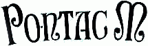
The closest match I could find is Mr Canfields.
It's not a 100% match, looks like somebody else's take on the same script from The Charles Bluemlein Script Collection
It's not a 100% match, looks like somebody else's take on the same script from The Charles Bluemlein Script Collection
Police suggérée : Mr Canfields

Bourgeois
Bold Condensed for "HOUSE" and "CARDS"
Book Condensed italic for "of"
Bold Condensed for "HOUSE" and "CARDS"
Book Condensed italic for "of"
Police identifiée : Bourgeois

Police identifiée : Bootle

fmontpetit a dit 
Discussed many times on this forum.
Mistral
Mistral
Question was "Not the actual "Drive" but the smaller text that says "There Are No Clean Getaways".
Going by an extra-large version of the same poster found here

Police identifiée : Orator Slanted
Édité le 27/11/2012 à 20:20 par SexyElvis7
I believe this is handwriting. There are fonts with a similar feel, but not a perfect match.
javiero a dit
Hmm seems a little thiner nO?
I don't know, looks good to me


TLC - not sure if a font was used, but the geometry of Proto Sans 56 is a good match.
Tables, Ladders, Chairs - can't find a perfect match, but Power Station Solid Wide is close
Tables, Ladders, Chairs - can't find a perfect match, but Power Station Solid Wide is close
Police suggérée : Proto Sans 56

Police identifiée : Comic Strip Poster

Police identifiée : PIX Lite


Police identifiée : Quirkley

Fuseau horaire : CEST. Il est actuellement 16:05
