
Forum
840 posts Polices identifiées Requêtes seulement
Posts par metaphasebrothel

datusername, you'll need to make your images monochrome, (ie: just black and white), before you can import them into a font editor. Your photographs probably contain many colours, You can use photoshop to turn your colour images to black and white before importing them into your font editor, but that's only the first step - those imported images will be rough around the edges; you'll need to smooth them out, or your font will look like shit.
Thanks, Lancon, I would give you a green on the ID, but I leave that to other forum mods whose recognition skills exceed mine.
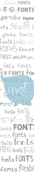
If more than one font is in use, it's the S and R that interest me.
Thanks!
~bito

Thanks!
~bito
Image originale : http://s26.postimg.org/h8btc3nlh/wsi_logo.jpg
koeiekat a dit 
Then why didn't it say so?
It would have taken more than the forty-eight characters allowed by Twitter.
Court.311 a dit
I think he meant 'Why can't I download from DaFont onto my Mini iPad©®™. I think he just wants some fonts, not the whole site.
cshaugh a dit
How to remove and save for restoration Windows 8 default fonts?
Windows 8 allows you to hide fonts, but they are never hidden in the font list in the office products. (Best I can tell.) The only way to remove them from the list is to delete them from the font folder. I would like to remove(read: delete) all those that I never anticipate using, BUT I would like to have a method of restoring them if I figure out later that I need them. I know that I can do a full system restore to a date prior to my deleting the fonts, but that comes with lots of unwanted baggage.
Is there some means of "moving" the font files I want "deleted" to another folder so that they do not appear in the office products? Or is there some other means of deleting them completely and getting them back later if needed?
Chuck
Chuck, this is what I would do, using Windows XP - the procedure should be the same, or similar, with Windows 8:
Open Windows Search, and search for files and folders. Do not put any information in the file name field, but specify the search location as C:\Windows\Fonts. Click the Search Button. The results will show you all of your installed fonts. You could select/ copy/ paste all of them to a different folder, and then you can delete some installed fonts, knowing that you could reinstall them later.
If you try to cut, copy, or rename an installed font, it will become corrupted.
@Leaky: You've partially misunderstood me. I use ScanFont 3, which is no longer sold by FontLab. It's a 1990's era stand-alone font editor that only works with Windows XP and earlier operating systems. The $99 ScanFont 5 is a completely different animal; it's a plug-in for FontLab's Studio5 product.
I have ScanFont 3, Font Creator 5, and Studio5 installed on my computer. I use Studio 5 for a few routine tasks. I don't use Font Creator. I use ScanFont 3 all the time. I am not a professional font designer.
Despite what koeiekat says, professional font designers are likely to use Studio5. It has the most features, and is the most expensive. I think the kat and I define "professional" differently. If a busker makes a few bucks playing songs on a street corner, and they are otherwise unemployed, one might argue that they are a 'professional musician'. I wouldn't.
Very good semi-pro fonts can be made with applications other than Studio5. You can also get a pretty good haircut with a pair of scissors purchased at Dollarama.
If you've never made a font before, both you and your client are going to be disappointed by the results. Are you prepared to create both an upper and lower case alphabet, numbers, symbols, etc., from your imagination, and have them scale properly at fifty different sizes? You're much better off buying a commercial license for an existing font.
If you want someone to do custom lettering, you should look at Keith Morris' work: http://www.keithmorris.com.au/. He might tell you what Campbell's Soup paid for the custom font he made for them.
~bobistheowl
FontAddict a dit
in short bunch o' retards staff and members alike. oh frenchmen too much font and it will kill your brains. lol
We won't be hearing from this troll for at least ten days.
koeiekat a dit
metaphasebrothel a dit
No one makes professional fonts with FontCreator. ...
A bold statement for someone who only uses non-professional software and never even has tried to work with Font Creator.
I use ScanFont 3, from FontLab. There's nothing non-professional about it. When it was sold by FontLab, it cost approximately $500, when FontLab's Studio5 cost about $650. I also have working copies of FontCreator and Studio5, but I find ScanFont 3 to be superior for most tasks. I only use Studio5 for certain tasks, such as adjusting vertical metrics, or generating Open Type fonts.
I did try out FontCreator 5 a couple of times. It can do many of the same tasks as ScanFont 3, but not as well. FontCreator CAN open an Open Type font, which ScanFont 3 can't do, but I can do that with Studio5, or convert the .otf to .ttf. ScanFont 3 has some really amazing editing features. Unfortunately for most people, it only works with Windows, and only with XP operating system or earlier, so Vista, 7 and 8 users are SOL.
If you were to poll Commercial font designers, I doubt any of them use Font Creator, and none of them use ScanFont 3, either.
No one makes professional fonts with FontCreator.
Professionally designed fonts, made on a work-for-hire basis for the exclusive use of a client, would probably cost somewhere in the $100,000 range. The completion time would be in the six months to two years range.
A shitty amateur font can be made in half an hour.
What you need to do is go to Myfonts.com or Fonts.com or the home page of a professional designer or foundry, find a font that your client likes, and buy a commercial use license.
FontAddict a dit
... i'm just a kid and i dont have credit card or paypal or any way to pay you gus online. please reconsider it would be great help for my projects... i'm an amateur audio editor making instrumentals out of songs (popular/latest release). just like the image provided below v - i'm making cover arts for my instrumentals so i'm looking for a font that cannot be found in the web or anywhere and that is a custom made font...in short i didn't know making fonts requires skills 

So, you're "a kid" who makes CDs, but not for profit, and you need an exclusive font for this, but you didn't know it takes skill to make a font. At least some of that story isn't true, son.
You should browse through some of the pages on Luc Devroye's site, http://luc.devroye.org/fonts.html. Among font designers, look at the work of Manfred Klein, Dieter Steffmann and Peter Wiegel in particular, all of whom have produced many high quality fonts in the genre you seek.
Manfred Klein: You will not be able to contact him. He retired from typography in 2008, to care for his wife, who was quite ill. Based on anecdotal information from a knowledgeable third party, I believe he was experiencing symptoms of Alzheimer's Disease around that time. If you want to use any of his fonts commercially, make a donation to a charitable foundation of your choice.
Dieter Steffmann: As far as I can tell, the conditions to use a Dieter Steffmann font commercially are that you ask politely on the comments section of his site, and he grants permission to people who show him this measure of respect. I don't think there is ever a fee involved.
Peter Wiegel: Peter does free, free for personal use, and commercial fonts. You'd want to check the terms of use for the font in question, if you plan to use one of his.
All three of these gentlemen have huge numbers of fonts available on DaFont, and many more available elsewhere.
Why not just retrieve it from your recycle bin, or whatever that's called on Mac, and install it again?
At the top of the DaFont browser window, there's a link called "Themes". The Thunderbirds are Go font is in the Fancy -> Western category. Why not browse through the Fancy -> Western category, for other similar fonts?
At the top of the DaFont browser window, there's a link called "Themes". The Thunderbirds are Go font is in the Fancy -> Western category. Why not browse through the Fancy -> Western category, for other similar fonts?
FontAddict a dit
hey everyone,is it possible for someone who can make a custom font for me? i need a calligraphic type of font custom made.
thanks
thanks
No one ever needs a new font, you just ♦want♦ one. You don't quite know what you want, you just know that you want someone to make it for you, for FREE, because it would be 'a great help for [your] projects'.
If you said: "I need someone to clear the rocks and trees from this 100 hectares plot of land, plough the ground, plant cotton, pick the cotton and clean it, for free. I need it for my clothing factory.", do you think anyone would volunteer?
Here's a better idea: Sit on a street corner with a sign around your neck that reads "Need Money for Fonts". If each person who walks by gives you only 1% of their monthly income, within a few years, you should have enough money to hire someone to make custom fonts for you.
swedshcrafter, if you were planning to release the font 'as is', it would, indeed be 'rubish', (sic). It appears to me that you make fonts by importing monochrome bitmaps into your font editor, as opposed to drawing the glyphs with the font editing tools.
I use imported bitmaps, and modify them in the editor. The program I use, ScanFont 3, is well suited for that. Unfortunately, it's no longer sold, and it doesn't work with Windows operating systems more recent than XP. It's also a completely different product than the ScanFont 5 currently sold by FontLab. SF 3 is a stand alone font editor; SF 5 is a plug-in for FontLab's Studio5 product.
koeiekat's comment about '2048 units per em' is related to my comment about the 1435 caps height. It involves a change to the vertical metrics and dimensions. I know how to do that with Studio5, but not with FontCreator.
There should be a tool in FontCreator that would allow you to 'zoom in' the view of a glyph to enormous sizes. If you use an enlarged view, you'll see that quite a number of lines that should be exactly straight, aren't. You might not see the errors at 72 points, but when the text size is changed, they will be noticeable. If you have a viewing option for 'guidelines' or 'hints', enable it. This should display horizontal and vertical guidelines. For a horizontal or vertical straight line, the guideline should pass directly through the center of both nodes. You should do that at maximum enlargement, because a the margin of error may be small.
In this enlarged view of the top of your P, note that an unnecessary node causes the line to not be straight:

Here's a before and after, with about a minute of clean up - note that horizontal and/ or vertical alignments of your nodes can help with the design:

~bobistheowl
I use imported bitmaps, and modify them in the editor. The program I use, ScanFont 3, is well suited for that. Unfortunately, it's no longer sold, and it doesn't work with Windows operating systems more recent than XP. It's also a completely different product than the ScanFont 5 currently sold by FontLab. SF 3 is a stand alone font editor; SF 5 is a plug-in for FontLab's Studio5 product.
koeiekat's comment about '2048 units per em' is related to my comment about the 1435 caps height. It involves a change to the vertical metrics and dimensions. I know how to do that with Studio5, but not with FontCreator.
There should be a tool in FontCreator that would allow you to 'zoom in' the view of a glyph to enormous sizes. If you use an enlarged view, you'll see that quite a number of lines that should be exactly straight, aren't. You might not see the errors at 72 points, but when the text size is changed, they will be noticeable. If you have a viewing option for 'guidelines' or 'hints', enable it. This should display horizontal and vertical guidelines. For a horizontal or vertical straight line, the guideline should pass directly through the center of both nodes. You should do that at maximum enlargement, because a the margin of error may be small.
In this enlarged view of the top of your P, note that an unnecessary node causes the line to not be straight:
Here's a before and after, with about a minute of clean up - note that horizontal and/ or vertical alignments of your nodes can help with the design:
~bobistheowl
I can't help anyone to do this. I don't have a version of FontCreator that can open .fcp file type. I thought I could, when I made this post originally. This portion was added on November 28, 2014.
A few comments:
1) your kerning, (space between glyphs), is way off on the capital J, the lower case a, and numbers 0 and 4.
2) The S needs to be taller. I think it's currently the same height as the flat topped letter; the letters with curved tops should be slightly taller, so they 'appear' to be the same height. Notice how it appears to be smaller than the T at both the top and the bottom:

3) The capital O and the zero are really bad. You have way too many nodes on the exterior, which gives them the 'Flintstones' look, when enlarged. I don't use FontCreator, but it probably has a feature whereby you can right-click on a node, and select 'delete'.

Conventional wisdom would use exactly four nodes on the perimeter of the O and zero, at North, South, East and West, but it can be done with three.
4) You should look into the Caps Height settings. Although the glyphs appear to be 'normal size', the caps height of 1435 is a bit more than double what it should be, (usually somewhere between 680 - 715)
I used the zip file from claudeserieux, and Studio5 to generate the font files.
~bobistheowl
Édité 3 fois. Dernière édition le 28/11/2014 à 06:10 par metaphasebrothel
A few comments:
1) your kerning, (space between glyphs), is way off on the capital J, the lower case a, and numbers 0 and 4.
2) The S needs to be taller. I think it's currently the same height as the flat topped letter; the letters with curved tops should be slightly taller, so they 'appear' to be the same height. Notice how it appears to be smaller than the T at both the top and the bottom:
3) The capital O and the zero are really bad. You have way too many nodes on the exterior, which gives them the 'Flintstones' look, when enlarged. I don't use FontCreator, but it probably has a feature whereby you can right-click on a node, and select 'delete'.
Conventional wisdom would use exactly four nodes on the perimeter of the O and zero, at North, South, East and West, but it can be done with three.
4) You should look into the Caps Height settings. Although the glyphs appear to be 'normal size', the caps height of 1435 is a bit more than double what it should be, (usually somewhere between 680 - 715)
I used the zip file from claudeserieux, and Studio5 to generate the font files.
~bobistheowl
Édité 3 fois. Dernière édition le 28/11/2014 à 06:10 par metaphasebrothel
Inside the download .zip file is a text document named "Read me". Read the Read Me, and you'll be able to answer your own question.
In each of the forums, the threads with the most recent posts are at the top of the list. If someone is impatient, needs instant gratification, or if they have waited a reasonable period of time without a reply from someone, they post "Bump" to move their post to the top of the list. The length of time between the original post and the bump pretty well determines the motive of the person who made the post in the first place.
With font identifications, when someone recognizes the font, it's usually on the same day someone asked for the ID. If the ID request drops down to the second page, chances are good that no one here here knows the name of the font.
With font identifications, when someone recognizes the font, it's usually on the same day someone asked for the ID. If the ID request drops down to the second page, chances are good that no one here here knows the name of the font.
Pf weldy, it sounds like you're trying to install the .zip file instead of the font.
A .zip file is a compressed archive that can contain more than one file. The size of the .zip file is smaller than the size of the files inside, sort of like if you sit on a full suitcase, to be able to close it. Because .zip archives are smaller, they use up less disk space on your computer, they can be downloaded faster, and they use less bandwidth for the transfer from DaFont to your computer.
Probably about half of the download .zips on DaFont contain more than one file - often there are more than one style of the font, and/ or there's a read me or commercial use license document, and sometimes a graphic or character guide. If the files were not in a .zip, you would have to make a separate download for each file, and a lot of people would just download the font - which isn't what the designer of the font wants.
Try right clicking on the picture icon for the Respective font, and look for an option in the menu to Extract, in other words, to move the files that are in the .zip to a folder that's not compressed. After you have extracted the files, you'll be able to recognize the font file(s) by the picture icon. Do a right-click on a font file, and select "Install" from the menu, for Windows Vista.
trlenz a dit
...Does anyone know if there is a reason why zapfino is part of the Mac OS software, but cannot be obtained without purchasing a license for PC?
From MyFonts:
"Todays digital font technology has allowed renowned type designer Hermann Zapf to realise a dream he first had more than fifty years ago: to create a fully calligraphic typeface. Zapf began work on Zapfino in 1993, in technical collaboration with David Siegel and Gino Lee, who were responsible for the initial digitization. The initial PostScript and TrueType versions were completed and released by Linotype as a set of six fonts. The current Zapfino megafont for Apple Advanced Typography (AAT) and Open Type was built for Linotype Library by Tiro Typeworks. The new version includes additional diacritic characters for the Latin script languages of Central and Eastern Europe, the Baltic states, and Turkey.
Zapfino consists of four basic alphabets, with many additional stylistic alternates, which can be freely mixed together to emulate the variations in handwritten text. Because of the complexity of the design of Zapfino some tips on its use might be helpful:
1) When it is necessary to set words in all uppercase letters, such as abbreviations in text, use only the basic Zapfino capitals with plenty of letter spacing.
2) The more extravagant swash variants, especially those with long flowing ascenders and descenders, should be used sparingly. They should accentuate and ornament the text, not overpower it.
3) Although every care has been taken to carefully space and kern the Zapfino characters, and most variants can be freely mixed, some combinations of letters inevitably look better than others. Take the time to choose variants that will create pleasing word shapes and, in particular, beware of colliding descenders.
4) Line spacing, or leading, should be generous, to allow room for the many long ascenders and descenders. The longest of these might be best reserved for the first and last line of text, respectively, where they can flow freely into the upper and lower margin.
MyFonts only sells the original six weights/styles. The following others are probably in the ATT megafont:
ZapfinoExtraLT-Alternate
ZapfinoExtraLT-One
ZapfinoExtraLT-Two
ZapfinoExtraLT-Three
ZapfinoExtraLT-Four
ZapfinoExtraLT-Ligatures
ZapfinoExtraLT-Ornaments
ZapfinoExtraLT-Pro
ZapfinoExtraLT-SmCaps
ZapfinoForteLT-One
ZapfinoForteLT-Alternate
ZapfinoForteLT-Pro
If there are any others, I don't have them.
Heidelberger Druckmaschinen originally released at least two weights, (One and Two), around 1999, but perhaps only in .ttf.
Édité le 06/03/2014 à 17:31 par metaphasebrothel
Fuseau horaire : CEST. Il est actuellement 18:59
