
Forum
3 821 posts Polices identifiées
Posts par donshottype


Available from ATF from 1936 onwards
Not to be confused with ITC Bookman, which is a later design.
Édité le 11/01/2016 à 03:28 par donshottype
Not to be confused with ITC Bookman, which is a later design.
Police suggérée : Bookman
Édité le 11/01/2016 à 03:28 par donshottype
An old Visual Graphics Corporation font called Sol.
Pay version as Digital Sans Now
Pay version as Digital Sans Now
Police suggérée : Digital Sans Now
Seems to be some old wood type that was used for the nameplate.
Good choice for a substitute.
This is the Monotype version first published in 1940.
Not certain who first did the design -- it's a version of the French Clarendons that were popular in the 19th century.
Perhaps Stephenson Blake or American Type Founders.
Old Town No 536 seems to be the same design as Figaro.
I mention this mainly because Old Town No 536 can be purchased for 60% less than Figaro
There are also versions that include Cyrillic and Greek letter forms: http://myfonts.us/td-8lsxD7
Édité le 12/01/2016 à 13:26 par drf
Good choice for a substitute.
This is the Monotype version first published in 1940.
Not certain who first did the design -- it's a version of the French Clarendons that were popular in the 19th century.
Perhaps Stephenson Blake or American Type Founders.
Old Town No 536 seems to be the same design as Figaro.
I mention this mainly because Old Town No 536 can be purchased for 60% less than Figaro
There are also versions that include Cyrillic and Greek letter forms: http://myfonts.us/td-8lsxD7
Police suggérée : Old Towne No 536
Édité le 12/01/2016 à 13:26 par drf
Thanks. A master of flair in typeface design. Most monoline fonts look mechanical but Busorama escapes the trap of rigid geometry. The circles are combined with some more subtle arcs.
I'll add this to my list of his fonts.
I'll add this to my list of his fonts.

Handlettering.
The _S_ is similar to Seagram but you might pick another blackletter for the lower case.
The _S_ is similar to Seagram but you might pick another blackletter for the lower case.
Police suggérée : Seagram TFB
Edited:
Does anyone know who designed the original font? Presumably somebody who produced for ITC.
A few more variations are shown in
http://bowfinprintworks.com/BauhausFaces6.html
... image embed problem
Édité 8 fois. Dernière édition le 12/01/2016 à 13:14 par donshottype
Does anyone know who designed the original font? Presumably somebody who produced for ITC.
A few more variations are shown in
http://bowfinprintworks.com/BauhausFaces6.html
... image embed problem
Édité 8 fois. Dernière édition le 12/01/2016 à 13:14 par donshottype
Interesting discussion.
The rub-on letters shown in my Letraset product manual included an _H_ with an the crossbar extending to the right.
The rub-on letters shown in my Letraset product manual included an _H_ with an the crossbar extending to the right.

Salvo Serif Extra Condensed Regular

is a closer match for width and the curved shapes of _C_, _O_ and _R_ but some serif locations do not match
is a closer match for width and the curved shapes of _C_, _O_ and _R_ but some serif locations do not match
Police suggérée : Salvo Serif ExtraCond
Did not find an exact match but Fakt Slab Condensed Medium is close

Police suggérée : Fakt Slab Condensed Medium
Digital Alexei Copperplate (1992) was sold by Corel Corporation as part of its Corel Draw program.
You can get a legitimate copy by purchasing the Corel program.
The Alexei Copperplate fonts downloadable from questionable sites are rips of that version.
David Harris designed the pre-digital font.
P.S. Some people question the legitimacy of fonts bundled with Corel Draw, Illustrator and other programs. This would seem to be a legal issue that should not affect the end user of these products.
Édité le 09/01/2016 à 09:04 par donshottype
Police identifiée : Handel Gothic

Police identifiée : Mesquite

@scotrinaf
Happy my small contribution was of help to you.
Happy my small contribution was of help to you.
Police identifiée : Impact
The author of Magenta, Florian Bambhout, notes that "The design of this font has been inspired by Inverserif typeface from Infinitype.(also known as Speedway from FontBank, Concorde from Brendel Informatik, OptiIambic from Castcraft, etc...)"
So any of these could also be used.
So any of these could also be used.

Police suggérée : Magenta
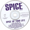
California Grotesk Bold for SPICE UP YOUR LIFE, with some editing, such as opening the vertical distance between the terminals on _C_.
Some editing to make the main SPICE -- based on Black or a Black/Bold blend, with diagonal on _S_ made more horizontal.
Édité 4 fois. Dernière édition le 07/01/2016 à 19:14 par donshottype
Some editing to make the main SPICE -- based on Black or a Black/Bold blend, with diagonal on _S_ made more horizontal.
Police suggérée : California Grotesk Bold
Édité 4 fois. Dernière édition le 07/01/2016 à 19:14 par donshottype

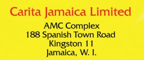
Custom trademark.
It started out as Fritz Stelzer's Monotype Script, which dates from 1931.
It started out as Fritz Stelzer's Monotype Script, which dates from 1931.
Police suggérée : Script
Fuseau horaire : CEST. Il est actuellement 18:41
