
Forum
277 posts Polices identifiées
Posts par DPape

Police identifiée : Sketchy Times
Maybe.
Police suggérée : Protocol W26 Light
I looked and didn't find a match. Could be hand written.

Police identifiée : DIN

/a and /e are different each time therefore likely hand written, even though /Lo has terrible letter spacing.
The weight of the letters and letter spacing varies so seems prepared by a manual typewriter.

Police identifiée : Viper Black Bold
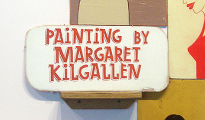
Duplicate letters are not the same. Sign is hand written.

For instance, the 1999 program The Font Thing only works with ttf extensions. If you simply rename the font from xxx.otf to xxx.ttf everything works.
Lauren. Thanks for the note. I can't think it would do any good trying to defend yourself against the drive-by pot shots. A lawsuit probably wouldn't work because they don't speak for Typophile. They are letting their "noses" drive their brains. Very "boy like". Hah.
You might contact the moderator to ask for an explanation. Or not... DPape
You might contact the moderator to ask for an explanation. Or not... DPape
Windows is saying the names are the same. You have to uninstall one to get the other installed. Windows does not look at the design or anything other than the name.
The only way to get them both in together is if the (internal) names are different. Takes a font editor to do it.
The only way to get them both in together is if the (internal) names are different. Takes a font editor to do it.
There are innumerable sans serif fonts where uc /I has arms.
For one:
Harcourt Education/HeinemannSpecial-Roman [[http://www.myfonts.com/fonts/fw-heinemann/heinemann-special/]]
Here are some more names -- other than the armed /I and being sans serif I know nothing about any of them:
Krebs, Manuel/Replica-Mono
Kreative Software/Miranda 25
A Lee/Ongdalsam
Global Village/FocalPoint On Line
Excalibur Monospace
Gentlemen:
I have recently been involved in a series of discussions about fonts which appear to be similar to other, more expensive fonts and would like some counsel.
If a Dafont font is similar in design/style to another more famous font does Dafont filter these out of the catalog? Is there some threshold filter, automatic or procedural, to eliminate too-looks-a-like? If an outsider suggested a Dafont font is derivative, at some level, is there a process to verify this allegation?
Rhetorical: Is there a way to break the knees of someone who cries "fraud" too often via email?
Dick Pape

Police suggérée : Digital Sans Medium Italic
Fuseau horaire : CEST. Il est actuellement 12:44
