
Forum
43 police identifiées Tous les posts Requêtes seulement
Polices identifiées par Unique Printer

Police identifiée : Good Vibrations Script
Police identifiée : Comic Sans

Police identifiée : Jack Armstrong
Police identifiée : Sign Painter Brush

Police identifiée : Impact

Police identifiée : News Gothic
Édité le 09/07/2019 à 22:35 par Lemmiwinks

Police identifiée : Metropolis 1920


Most, if not all, computers have this font on them already. There are also a few free alternatives you can find online.
Police identifiée : Century Gothic
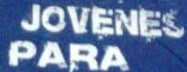

This looks really close minus the upward swipe on the 'S' and the second line on the right of the 'A'
Police identifiée : Seagram TFB
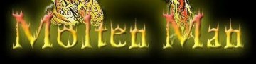
Police identifiée : Cheap Fire


Police identifiée : IFC Rail Road

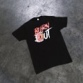
They modified the lowercase 't' to get rid of the connector at the beginning of the letter.
Police identifiée : Rage Italic
Police identifiée : Another Danger
Fuseau horaire : CEST. Il est actuellement 09:31
