
Forum
2 209 police identifiées Tous les posts Requêtes seulement
Polices identifiées par Tomás Silcher


Police identifiée : Dinot Cond Bold

Police identifiée : Frutiger Black

Police identifiée : ITC Handel Gothic Heavy Italic
Police identifiée : Garamond Bold
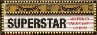
Police identifiée : Helvetica Neue Bold Condensed

Police identifiée : Gill Sans Light

Police identifiée : Zapfino One

Police identifiée : Frankfurter Highlight

Police identifiée : English 111 Vivace

Strange one ... looks like an "Albertus" with extra stroke weight on it. 

Police identifiée : Albertus

Note: It's actually lowercase text, not uppercase.
"A" is modified.
"A" is modified.
Police identifiée : Neutraface Display Titling

Police identifiée : Gotham Light


Police identifiée : Eurostile Next Extended Bold
Édité le 07/05/2012 à 22:34 par Rodolphe

Police identifiée : Adobe Garamond Bold

Police identifiée : Didot Italic

Police identifiée : ITC Avant Garde

Police identifiée : Antique Olive Bold

Police identifiée : Apple Chancery
Fuseau horaire : CEST. Il est actuellement 07:59
