
Forum
6 posts
Not all displays kerning

Working with FontForge, I did kerning for font. It displays well here https://drive.google.com/file/d/1k1K3VYXtLs8gmTroFrRJsKaZtriy6vfS/view?usp=sharing . Also I already work with it in Photoshop and Illustrator https://drive.google.com/file/d/1VGThsHYkEoaAyhbeUv8_MgqiLfX2NBmX/view?usp=sharing .
But on sites kerning is not visible in the font https://drive.google.com/file/d/1YTVSXzmydMMnRfWHgLfA0JHrXZT4e1-L/view?usp=sharing and https://drive.google.com/file/d/1N1eJhWK7Oiv_tyQs0bTznxve8R2d_HkE/view?usp=sharing
Does anyone know what the problem might be?
But on sites kerning is not visible in the font https://drive.google.com/file/d/1YTVSXzmydMMnRfWHgLfA0JHrXZT4e1-L/view?usp=sharing and https://drive.google.com/file/d/1N1eJhWK7Oiv_tyQs0bTznxve8R2d_HkE/view?usp=sharing
Does anyone know what the problem might be?

It is very likely that those sites do not support kerning and it looks like you rely too much on kerning.
I have not seen your font so this is just an opinion based on what I see on your images. I assume that image 3 and 4 are showings from different sites. It shows that your font is either too tightly spaced or those sites mangled the font's kerning but I still say it is tightly spaced. You should try to space your letters similar to what is shown in image 1 and 2. Kerning should never be used as the primary method of spacing the letters. What you should do is redo your letter spacing or horizontal metrics. First delete all of the font's kerning and then adjust the spacing the best you could. When you get an almost perfect spacing you will still see some letter pairs that require further adjustments. That's the time to start kerning your font. When you've done the best you could, grab some paragraphs of text from the web and use your font on it. Do you see some letter pairs that look too loose or too tight, kern those pairs. I will guarantee you that your font will look a lot better on sites that do not support kerning for their previews.
But before doing all of these, keep a backup copy of your original FontForge file just in case you do not like the result of the modification.
BTW I do not know how to use FontForge so I cannot answer any question specific to FontForge but there are many here who are extremely good at FontForge
toto@k22, thanks for the advice, I will try to fix the situation.
I had a look at your font and it is very dependent on kerning. It should not be that way. Here's your font with kerning turned off (top) and with kerning (bottom)
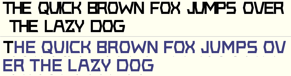
Adjust the spaces to the left and right of a letter/symbol as best as you could. Then use kerning to fine tune the spacing between letters.
Adjust the spaces to the left and right of a letter/symbol as best as you could. Then use kerning to fine tune the spacing between letters.
toto@k22 a dit 
I had a look at your font and it is very dependent on kerning. It should not be that way. Here's your font with kerning turned off (top) and with kerning (bottom)
Adjust the spaces to the left and right of a letter/symbol as best as you could. Then use kerning to fine tune the spacing between letters.
Adjust the spaces to the left and right of a letter/symbol as best as you could. Then use kerning to fine tune the spacing between letters.
Understood, thank you very much for your prompt help, I will refine the font

Fuseau horaire : CEST. Il est actuellement 22:44
