
 English
  Français
  Español
  Deutsch
  Italiano
  Português
Forum
 Topic plus récent
9 posts
PLease Help

 Citer
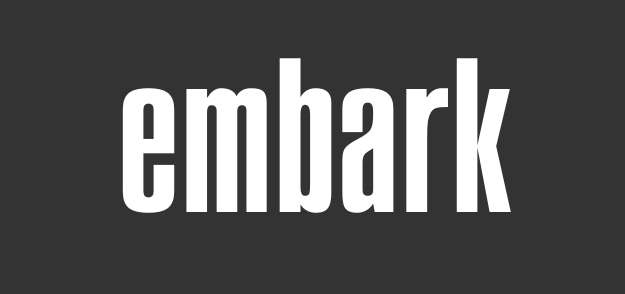
Citer I tried all COMPACTA, SWISS911 921, Plakette. I JUST cannot find this one. Would appreciate your help. Thank you in advance
Helvetica Suggérée par Twentyoneg
Swiss 924 Suggérée par donshottype
Block Gothic Demi ExtraCond Suggérée par wawahaha
Dharma Gothic Suggérée par imagi
Folio ExtraCond Bold Suggérée par donshottype
Action Condensed Medium Grade 3 Suggérée par imagi
Polices suggérées
Helvetica Suggérée par Twentyoneg
Swiss 924 Suggérée par donshottype
Block Gothic Demi ExtraCond Suggérée par wawahaha
Dharma Gothic Suggérée par imagi
Folio ExtraCond Bold Suggérée par donshottype
Action Condensed Medium Grade 3 Suggérée par imagi

Is this from a source before the digital font era?
Very few narrow heavy fonts have a compound curve for the middle stroke of _a_, which eliminates almost all of the usual candidates for a match.
Folio Extra Cond. Bold is fairly close for the _a_ and the other letters.
The most noticeable difference is the arm of the _r_.
Very few narrow heavy fonts have a compound curve for the middle stroke of _a_, which eliminates almost all of the usual candidates for a match.
Folio Extra Cond. Bold is fairly close for the _a_ and the other letters.
The most noticeable difference is the arm of the _r_.
Police suggérée : Folio ExtraCond Bold

Police suggérée : Action Condensed Medium Grade 3

Ultra Compressed. the "r" may be borrowed from another style of the same font.
Édité le 05/04/2017 à 02:54 par Twentyoneg
Police suggérée : Helvetica
Édité le 05/04/2017 à 02:54 par Twentyoneg
There is 2 Dharma Gothic M an E
Police suggérée : Dharma Gothic
Swiss 924 is perhaps the best match overall, particularly for the _a_, but like all of the other suggesstions the _r_ is rather different.
Predigital source of Swiss 924 is probably Stempel's Information Bold Condensed.
The letterforms of Swiss 914 are almost identical to Letter Perfect's Hadrian Bold, which has heavier arms on the _k_
http://myfonts.us/td-NjfHrx
I compared the full alphabet of Swiss 924 and Hadrian Bold and all letters are generally the same. So Hadrian Bold is probably also a revival of Information Bold Condensed.
It would be really helpful if we had some info on the source of _embark_ and more letters if they are available.
Édité le 05/04/2017 à 09:10 par donshottype
Predigital source of Swiss 924 is probably Stempel's Information Bold Condensed.
The letterforms of Swiss 914 are almost identical to Letter Perfect's Hadrian Bold, which has heavier arms on the _k_
http://myfonts.us/td-NjfHrx
I compared the full alphabet of Swiss 924 and Hadrian Bold and all letters are generally the same. So Hadrian Bold is probably also a revival of Information Bold Condensed.
It would be really helpful if we had some info on the source of _embark_ and more letters if they are available.
Police suggérée : Swiss 924
Édité le 05/04/2017 à 09:10 par donshottype
Bottom curve of arm on _r_ close to Helvetica Bold Cond, but top curve is not
http://www.myfonts.com/fonts/linotype/helvetica/pro-bold-condensed/glyphs.html#glyphs/531526/85
Vertical stroke too thick for the letters in _embark_
http://www.myfonts.com/fonts/linotype/helvetica/pro-bold-condensed/glyphs.html#glyphs/531526/85
Vertical stroke too thick for the letters in _embark_
Dharma Gothic ExBold is the best match for the compound curve for the middle stroke of _a_, but its _a_ has a tail.
Édité le 05/04/2017 à 14:02 par donshottype
Édité le 05/04/2017 à 14:02 par donshottype
Police suggérée : Block Gothic Demi ExtraCond
Fuseau horaire : CEST. Il est actuellement 14:56
