Derivat
9 934 téléchargements Gratuit pour un usage personnel - 2 fichiers
Derivat-No1.otfDerivat-No2.otfNote de l'auteur
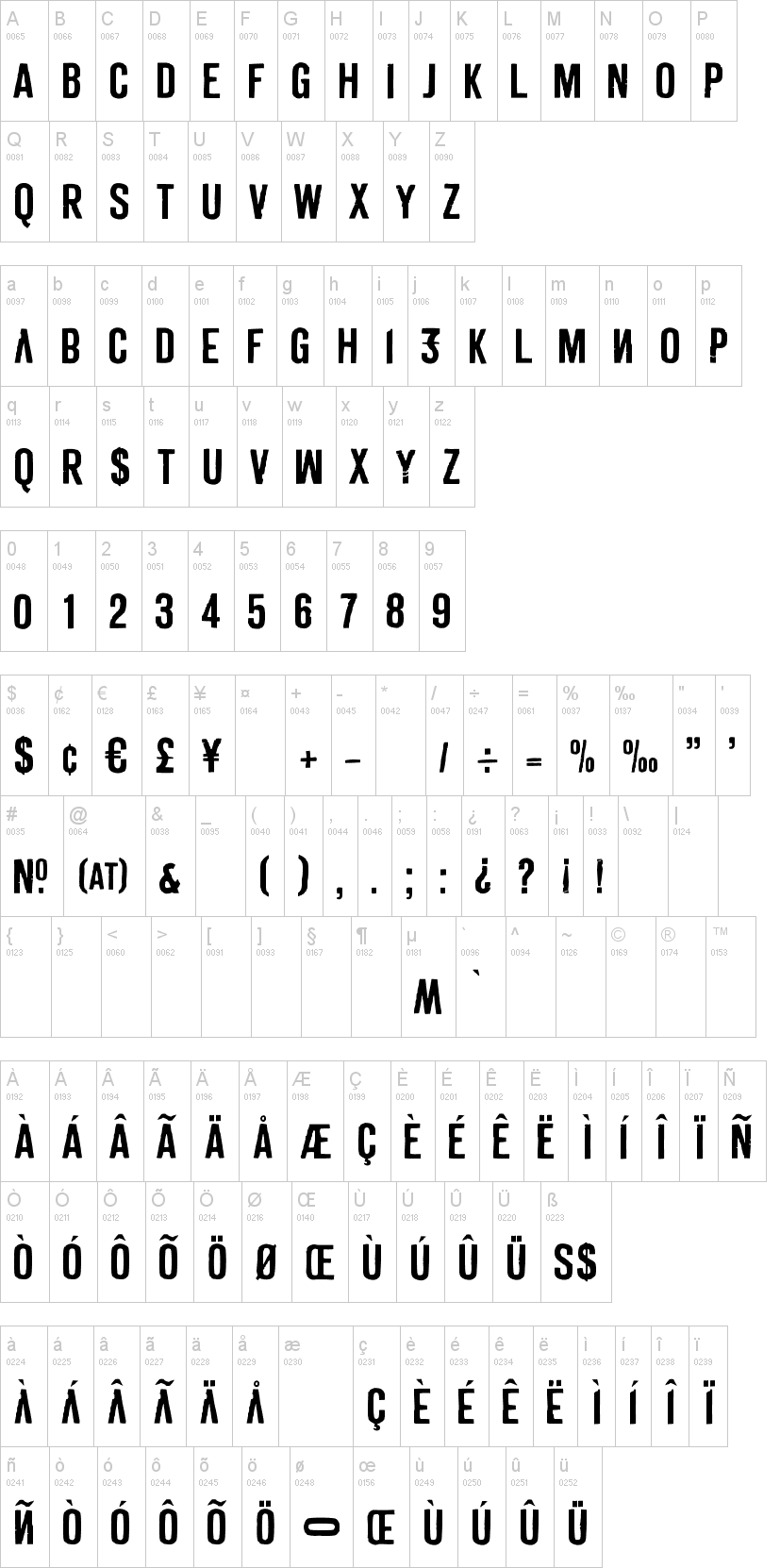
DERIVAT is based on rub-down lettering. Because single glyphs where soon missing on the sheet, people began altering other glyphs as a substitution for the missing glyphs. In the 80s this caused original aesthetics. Because it's an all caps font, DERIVAT uses this aesthetics by putting some altered uppercase glyphs in the lowercase slots. Additionally some glyphs in the lowercase slots where mirrored to add another disturbing effect.
After DERIVAT No1 was digitized the whole alphabet was scratched with a scalpel, then DERIVAT No2 was created with equal metrics to work as a layer font with DERIVAT No1. Together they can be colored different to get an even more eroded look.
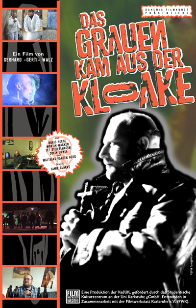
I used DERIVAT only once in 1998 for titling and packaging of a no budget Zombie film called "DAS GRAUEN KAM AUS DER KLOAKE" by Gerhard »Gerti« Walz, and I nearly forgot about it. But since I stumbled over it again, I now make it available to the public.
Thomas Mettendorf
/// After adding some essential glyphs like e.g. Euro, I now did an update to the font naming, since the conversion from 'Mac PostScript' to 'OpenType PS' caused problems in several apps, by showing only one weight in the font menu. Sorry about that ... but this second update hopefully will show both fonts in your application.
After DERIVAT No1 was digitized the whole alphabet was scratched with a scalpel, then DERIVAT No2 was created with equal metrics to work as a layer font with DERIVAT No1. Together they can be colored different to get an even more eroded look.
I used DERIVAT only once in 1998 for titling and packaging of a no budget Zombie film called "DAS GRAUEN KAM AUS DER KLOAKE" by Gerhard »Gerti« Walz, and I nearly forgot about it. But since I stumbled over it again, I now make it available to the public.
Thomas Mettendorf
/// After adding some essential glyphs like e.g. Euro, I now did an update to the font naming, since the conversion from 'Mac PostScript' to 'OpenType PS' caused problems in several apps, by showing only one weight in the font menu. Sorry about that ... but this second update hopefully will show both fonts in your application.
Mise en ligne sur DaFont : 11/01/2015 - Mise à jour : 17/01/2015