Pub de Zetafonts
Body Grotesque
dans Basique > Sans serif
28 677 téléchargements (17 hier) Gratuit pour un usage personnel - 4 fichiers
Body-Grotesque-Slim-Bold-trial.ttfBody-Grotesque-Bold-trial.ttfBody-Grotesque-Fit-Bold-trial.ttfBody-Grotesque-Large-Bold-trial.ttfNote de l'auteur
This font is for PERSONAL/NON-COMMERCIAL USE ONLY!
Download full version and commercial license:
http://www.zetafonts.com/body
For more info about our licenses:
http://www.zetafonts.com/licensing
---
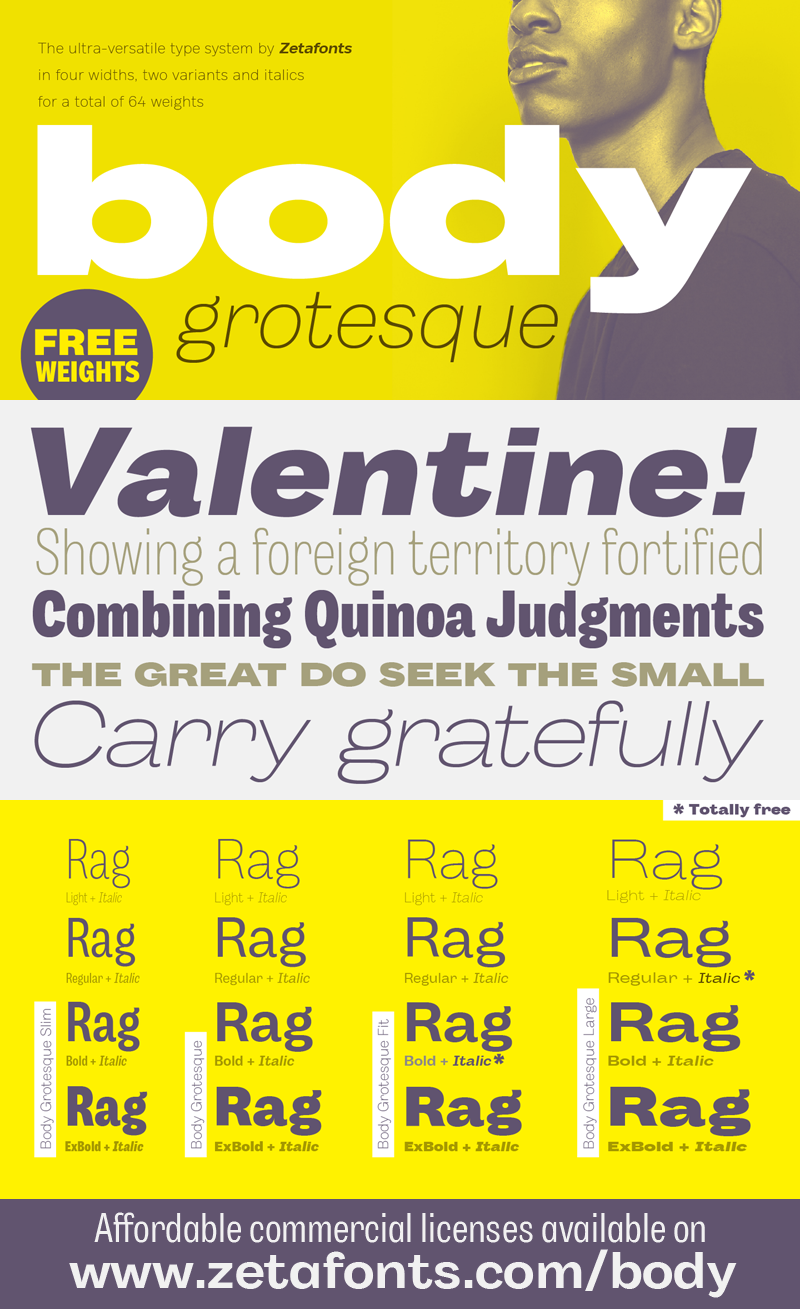
Body type family is conceived as a contemporary alternative to modernist superfamilies like Univers or Helvetica, it tries to maximize text readability while providing a wide range of options for the designer. It comes in two variants (Body Text and Body Grotesque), each in four widths (slim, normal, fit and large) and four weights: regular and bold for basic typesetting, light and extrabold for display use.
For both variants, the normal width family is slightly condensed in an effort to maximize space usage; the Slim width is provided for extremely dense texts or side notes while the Fit width is optimized for display usage as in logos, headings or titles. The Large width manages to look elegant in its light weight while becoming a valid heading or subtitle font in its extrabold weights.
Body Grotesque applies to the sans serif modernist skeleton little imperfections and quirks inspired by our research in early 20th century type specimens. Curves are slightly more calligraphic and a light inverse contrast is applied to bold weights, giving the typeface a slight vintage appearance in display use.
All the 64 fonts in the Body superfamily include a complete latin extended character set with small caps for over seventy languages, russian cyrillic, open type positional numbers, stylist sets and alternate forms.
Plus...
Download full version and commercial license:
http://www.zetafonts.com/body
For more info about our licenses:
http://www.zetafonts.com/licensing
---
Body type family is conceived as a contemporary alternative to modernist superfamilies like Univers or Helvetica, it tries to maximize text readability while providing a wide range of options for the designer. It comes in two variants (Body Text and Body Grotesque), each in four widths (slim, normal, fit and large) and four weights: regular and bold for basic typesetting, light and extrabold for display use.
For both variants, the normal width family is slightly condensed in an effort to maximize space usage; the Slim width is provided for extremely dense texts or side notes while the Fit width is optimized for display usage as in logos, headings or titles. The Large width manages to look elegant in its light weight while becoming a valid heading or subtitle font in its extrabold weights.
Body Grotesque applies to the sans serif modernist skeleton little imperfections and quirks inspired by our research in early 20th century type specimens. Curves are slightly more calligraphic and a light inverse contrast is applied to bold weights, giving the typeface a slight vintage appearance in display use.
All the 64 fonts in the Body superfamily include a complete latin extended character set with small caps for over seventy languages, russian cyrillic, open type positional numbers, stylist sets and alternate forms.
Plus...
Mise en ligne sur DaFont : 06/10/2018