Pub de Zetafonts
Bakemono Stereo
dans Basique > Largeur fixe
60 429 téléchargements (89 hier) Gratuit pour un usage personnel - 7 fichiers
Bakemono-Stereo-Thin-trial.ttfBakemono-Stereo-Extralight-trial.ttfBakemono-Stereo-Light-trial.ttfBakemono-Stereo-Regular-trial.ttfBakemono-Stereo-Medium-trial.ttfBakemono-Stereo-Bold-trial.ttfBakemono-Stereo-Extrabold-trial.ttfNote de l'auteur
The font here is for PERSONAL/NON-COMMERCIAL USE ONLY!
To download the full font family (all weights, glyphs and numbers) and acquire the commercial license please visit our website:
https://www.zetafonts.com/bakemono
For more info about our licenses:
https://www.zetafonts.com/licensing
CONTACT US:
website: https://www.zetafonts.com
have a question?: info@zetafonts.com
---
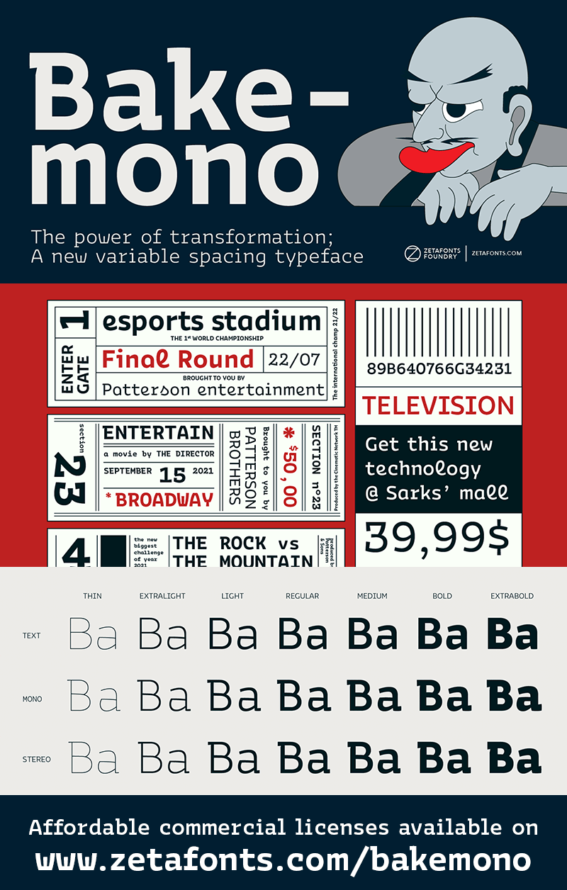
Francesco Canovaro created Bakemono as a way to explore the design space around the duality of fixed/proportional width. He was also interested in the concept of monowidth design, inherent in monospaced typefaces, that can bring flexibility and ease of use also to proportional type - allowing you to change the weight of a word without losing the text alignment. In his research on fixed width type design he mixed the lessons of mechanical typewriter technology with the intuitions of eastern brush calligraphy, which has been dealing with for centuries with fixed space grids.
The name of the typeface comes from the Japanese shape-shifter yokais that could change their form freely between human and animal, and aptly describes the metamorphic nature of this wide superfamily coming in proportional, monospace and intermediate subfamilies. With a design mixing the expansion principles of the brush with the sharp technicality of typewriter and system fonts, Bakemono can both excel at text size in its regular widths optimised for legibility as well as owning the page at display size with its uncommon design details. Plus...
To download the full font family (all weights, glyphs and numbers) and acquire the commercial license please visit our website:
https://www.zetafonts.com/bakemono
For more info about our licenses:
https://www.zetafonts.com/licensing
CONTACT US:
website: https://www.zetafonts.com
have a question?: info@zetafonts.com
---
Francesco Canovaro created Bakemono as a way to explore the design space around the duality of fixed/proportional width. He was also interested in the concept of monowidth design, inherent in monospaced typefaces, that can bring flexibility and ease of use also to proportional type - allowing you to change the weight of a word without losing the text alignment. In his research on fixed width type design he mixed the lessons of mechanical typewriter technology with the intuitions of eastern brush calligraphy, which has been dealing with for centuries with fixed space grids.
The name of the typeface comes from the Japanese shape-shifter yokais that could change their form freely between human and animal, and aptly describes the metamorphic nature of this wide superfamily coming in proportional, monospace and intermediate subfamilies. With a design mixing the expansion principles of the brush with the sharp technicality of typewriter and system fonts, Bakemono can both excel at text size in its regular widths optimised for legibility as well as owning the page at display size with its uncommon design details. Plus...
Mise en ligne sur DaFont : 26/06/2022