

Pub de Zetafonts
Arsenica
410 713 téléchargements (333 hier) Gratuit pour un usage personnel - 14 fichiers
ArsenicaTrial-Thin.ttfArsenicaTrial-Light.ttfArsenicaTrial-Regular.ttfArsenicaTrial-Medium.ttfArsenicaTrial-Demibold.ttfArsenicaTrial-Bold.ttfArsenicaTrial-Extrabold.ttfArsenicaTrial-ThinItalic.ttfArsenicaTrial-LightItalic.ttfArsenicaTrial-Italic.ttfArsenicaTrial-MediumItalic.ttfArsenicaTrial-DemiboldItalic.ttfArsenicaTrial-BoldItalic.ttfArsenicaTrial-ExtraboldItalic.ttfNote de l'auteur
The font here is for PERSONAL/NON-COMMERCIAL USE ONLY!
To download the full font family (all weights, glyphs and numbers) and acquire the commercial license please visit our website:
https://www.zetafonts.com/arsenica
Join the exclusive Type Club to get free fonts and special offers on new releases!
https://www.zetafonts.com/typeclub
CONTACT US:
website: https://www.zetafonts.com
have a question?: info@zetafonts.com
---
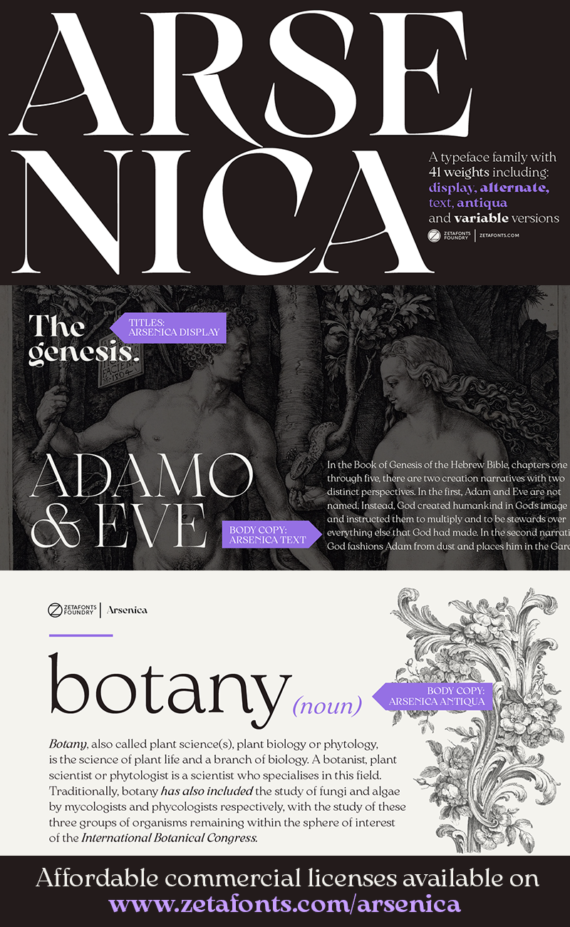
Arsenica is a serif typeface designed by Francesco Canovaro for Zetafonts, and developed by a design team including Mario De Libero, Andrea Tartarelli and Cosimo Lorenzo Pancini.
The design of Arsenica takes its inspiration from italian poster design at the beginning of the century, a time where typography, lettering and illustration where closely interwoven. Dawning nationalist movements, rather than using the modernist language, pushed on traditional Old Style letterforms often imbued with Art Nouveau and Deco sensibility. Artists like Giorgio Muggiani not only illustrated posters for Cinzano, Pirelli and Rinascente, but also provided logo design for newspapers, like "Il Popolo d'Italia".
Starting from this mix of eclectic influences, Canovaro first developed the Arsenica Antiqua family, designed as display typeface that keeps the original Old Style low-contrast, wide proportions and quirky stylistic inventions. These where then distilled in a high contrast, Arsenica Display family, expanding the weight range to include both poster, ultrabold weights and lighter weights that give the design a distinct calligraphic flavour. Bringing the letterforms into contemporary taste meant also developing alternate letterforms that were included in the Arsenica Alternate family, that drops the art nouveau details in favour of a more controlled modern serif aesthetic. Finally, Arsenica Text was developed by expanding the design space in the optical size axis, creating a low contrast, strongly readable old style typeface family, with a reduced weight set, oriented for long body copy typesetting. Plus...
To download the full font family (all weights, glyphs and numbers) and acquire the commercial license please visit our website:
https://www.zetafonts.com/arsenica
Join the exclusive Type Club to get free fonts and special offers on new releases!
https://www.zetafonts.com/typeclub
CONTACT US:
website: https://www.zetafonts.com
have a question?: info@zetafonts.com
---
Arsenica is a serif typeface designed by Francesco Canovaro for Zetafonts, and developed by a design team including Mario De Libero, Andrea Tartarelli and Cosimo Lorenzo Pancini.
The design of Arsenica takes its inspiration from italian poster design at the beginning of the century, a time where typography, lettering and illustration where closely interwoven. Dawning nationalist movements, rather than using the modernist language, pushed on traditional Old Style letterforms often imbued with Art Nouveau and Deco sensibility. Artists like Giorgio Muggiani not only illustrated posters for Cinzano, Pirelli and Rinascente, but also provided logo design for newspapers, like "Il Popolo d'Italia".
Starting from this mix of eclectic influences, Canovaro first developed the Arsenica Antiqua family, designed as display typeface that keeps the original Old Style low-contrast, wide proportions and quirky stylistic inventions. These where then distilled in a high contrast, Arsenica Display family, expanding the weight range to include both poster, ultrabold weights and lighter weights that give the design a distinct calligraphic flavour. Bringing the letterforms into contemporary taste meant also developing alternate letterforms that were included in the Arsenica Alternate family, that drops the art nouveau details in favour of a more controlled modern serif aesthetic. Finally, Arsenica Text was developed by expanding the design space in the optical size axis, creating a low contrast, strongly readable old style typeface family, with a reduced weight set, oriented for long body copy typesetting. Plus...
Mise en ligne sur DaFont : 15/12/2021
ArsenicaTrial-Regular.ttf

ArsenicaTrial-Italic.ttf

