
Forum
808 posts Identified fonts Requests only
Posts by tophy52


Identified font: Bleeding Cowboys
Identified font: Porky's
Identified font: Franklin Gothic
oui, la KEEP_IN_MIND !!
PS moi de même
PS moi de même

Ah la vache!
en plus je l'avais dans une de mes sélections !!
Bien vu !

en plus je l'avais dans une de mes sélections !!
Bien vu !


Suggested font: SC Gums kids
Suggested font: Shark random

But to look like the rest of the letters in
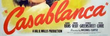
http://www.dafont.com/forum/read/4871/casablanca-motion-picture
the G, S are more important than your LORRE exemple
Look for Craiges Wrestlemania
http://www.dafont.com/forum/read/4871/casablanca-motion-picture
the G, S are more important than your LORRE exemple
Look for Craiges Wrestlemania
Suggested font: Craiges Wrestlemania
Suggested font: Jonny Quest
Suggested font: Honey Script
Suggested font: Brush Script
Suggested font: Brody
Suggested font: Curly Joe
A font that look alike will be easier to find !

Can't you see the paint brush marks in that title?
with 4 different 'a'!

Can't you see the paint brush marks in that title?
with 4 different 'a'!
Suggested font: Guitars !
All times are CEST. The time is now 21:46
