

Foro
62 posts Fuentes identificadas Sólo solicitudes
Posts de adamtrons
Does anyone know a font similar to the main King Arthur (2017) font?
Thank you for your time.
-Adam

Thank you for your time.
-Adam


Fuente identificada: Aquiline Two
Perfect! Thank you very much for taking the time to reply with the answer.
May good karma return to you a thousand fold!!
Ha ha.
May good karma return to you a thousand fold!!
Ha ha.
Looking for the "Tatooine" font. Any help is greatly appreciated.
-Adam

-Adam
Donshottype,
Thank you very much for the suggestions. I don't feel bad now that I could not locate a font for this. Looks like custom lettering not based on any particular font or style of writing. Bougainville is very nice. The "O's" are more narrow but the rest of the letters look pretty good. Thanks again.
-Adam
I would be grateful if anyone could help me find fonts that are similar to this lettering on the Queen Mary's Art Deco Observation Bar. Primarily looking for the main "Observation Bar" lettering but wouldn't mind knowing the secondary "An Art Deco Lounge" part as well. Thank you in advance for your help!
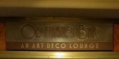

Fuente identificada: Splandor
Thanks koeiekat! You are GOOD. Can't believe you identified that one. Wow, they want a king's ransom at $200 for the package. I'm going to have to hold out until they sell the individual font!
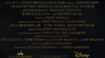
Looks like they've started using a new font for the Pirates of the Caribbean films. Anyone know if this font is available or if it's an exclusive?
Thanks in advance!
-Adam
Editado 2 veces. �ltima edición el 07/10/2016 a las 12:57 por frd
Thanks in advance!
-Adam
Editado 2 veces. �ltima edición el 07/10/2016 a las 12:57 por frd
Oh WOW! Thanks Fonatica!!! You're GOOD. I can't believe you answered my question so quickly! I thought it would take days to figure out. I hope great karma is returned to you!!!
Asking one last time before I give up. Ha ha.
I'm dying to find the font that is used in this letter from Dracula to Jonathan Harker in the movie Bram Stoker's Dracula (1992). I'm sure the original movie prop was hand drawn by a calligrapher but the font used in this reproduction is very close. If anyone can recommend something that I can sink my teeth into, I'd be very grateful. Okay, I'm done with the bad puns now! Ha ha Thanks!!

jerseygirl! T H A N K Y O U !!!!! I thought it may be impossible to find. How did you know this? May good karma return to you a thousand fold! Ha ha
-Adam
-Adam
Hello,
I need help identifying a font used on a document which is a replica of a pirate pardon. I�ve searched through about 100 pirate fonts but haven�t found it yet. It may be classified as a 16th or 17th century handwriting font. Not sure. I�m hoping someone here may have seen it or used it before and be able to identify it. Thank you very much for your time!
-Adam
Estabros- Thank you! The "A" is a little different but it's close enough for me, I think. Maybe they even mixed two different fonts. Not sure. The rest of the letters match perfect.
Can anyone please help me identify this Art Deco style font? Thank you in advance.

Yes, it's looking that way. I tried all the suggestions for adjusting the line spacing but that just made the text vanish from the screen or get worse. LOL The metrics settings probably do need adjusting as you say. I will see if MyFont is willing to do the work, as I'm ignorant of such things and also it would benefit future customers. Perhaps they could also send me a TTF to try. In the time being, I'm getting a copy of CorelDraw by the end of the week and will test the font in that application. The only other app I have is Adobe Photoshop Elements and that unfortunately does not include access to glyphs or special characters. Thanks again everyone for taking the time to reply. I appreciate it!
Okay. You guys were right. I should have contacted MyFont first. They were very kind with their response. I will post it here, in case someone happens upon my question in the future and perhaps the information can help someone else out there. I will have to test it later, when I get home...
"Applications such as MSWord is one of the very few applications out there that force the leading (or line spacing) override of the ascenders and descenders on screen. The problem can usually be fixed by highlighting the text and choosing Format > Paragraph, then changing the line spacing to 1.5 or 2 lines instead of single.
Something else you can try in Microsoft Word:
- Select the string of text with the clipped characters.
- Choose 'Paragraph' from the Format menu.
- In the Indents and Spacing window, enter 3 in the 'Before' box of the Spacing section.
One of these options should solve the problem. If it doesn't, please let us know and we'll dig a little deeper."
The problem I'm running into is that many font authors or companies do not test their fonts in Word and so when I contact them, they do not have any information for me. So if we put aside the exact font and where it came from, my general question is, "Can anyone confirm success using CorelDraw with style sets, swashes and ligatures?". I would really like to know a good program for the future and I wonder what other people are using successfully.
So here we are only allowed to discuss fonts created at Dafont? Is that correct?
Huso horario CEST. Ahora son las 16:58
