
Foro
13.712 posts Fuentes identificadas
Posts de koeiekat

I am not sure I fully understand what you want to achieve.
PSP shows the font family name in the list of available fonts (under Windows 7 that is installed fonts unless you use a tool to temporarily install fonts). That means you can only use one face of the font family at a time.
So when you want to see and be able to use all available faces of a font family with PSP you will need to rename each and every face, changing the family name, with the use of a font editor.
For example, the Arial. Family name is Arial. Sub names are Narrow, Bold, Italic, etc.to name a few. If you need to use all these faces at the same time in PSP you need to rename Arial (sub Narrow) to Arial Narrow as the family name etcetera.
Most font licensed forbid this sort of renaming. So be careful.
There is no such thing as a 1920's typography style. As typography concerns many styles were developed, still famous serifs and sans serifs came to us together with types with art nouveau and somewhat later art deco styles. So, be somewhat more precise what you are actually looking for. That might help.
Dax?
I wrote type.
Make a new pict. Type with space in-between the letters so that we can see the amount of black - or the lack of black - surrounding each letter.
KatyPerryFan4Eva ha dicho 
Condensed Fonts
I wish I could upload a picture of the criteria I am looking for in a font so that you guys would have an idea of what I am in need of.
I wish I could upload a picture of the criteria I am looking for in a font so that you guys would have an idea of what I am in need of.
BBC code: [img] image URL [/img]
There are about a million of condensed fonts out there. Take the time to find one that fits your needs. http://myfonts.us/td-9ajmGG
Editado el 17/03/2016 a las 13:41 por koeiekat
Somehow I don't think it'll pay for the coffee, thinking the first order is free and one only pays for the refill. So goes without paying before the refill comes ...
To make clear what toto means, a poster - or whatever - for a school event is not private use but public use. The fact that you do not make any money out of it is irrelevant. Private is by yourself for (only) yourself. Which is not the case.
The Kat keeps wondering why people with as it seems a resonable education which should be perfectly able to understand the meaning of personal still try to find ways to cheat.
The Kat keeps wondering why people with as it seems a resonable education which should be perfectly able to understand the meaning of personal still try to find ways to cheat.
To avoid a lot of hassle contact the company again and tell them (again) that you were not aware of this and suggest you buy the license after all. My guess is they will accept.
True, but also Typograf does print to PDF (as any program) and cost less than the $50 limit. That said, for $30 more at $79 (now) the MainType Pro works great. With a limited character height but Ultra Large may do the job. Does, however, not print the unicode but the glyph index.
Maybe first try the Standard edition and upgrade when needed?
Whatever, none will save the whole character map to an image, whichever format.
Maybe first try the Standard edition and upgrade when needed?
Whatever, none will save the whole character map to an image, whichever format.
Try Typograf. An oldie, but has an option to print the charmap: http://www.neuber.com/typograph/
All true. And yes ... a commercial font should (shall) be tested not only on Adobe applications but also on MS Office.But as Toto said, it is an easy (one-click) fix to get the Win acsender and descender right.

Fuente identificada: Pink

Fuente identificada: Brush Script
First of all, you shout. And only because of that you deserve to be ignored. Second, you posted and kept posting a enlarged image. If you had been able of reading and processing what you read you might have understood that enlarged images are not acceptable. Thus ...

Fuente identificada: Aaaiight!

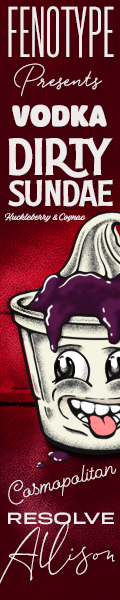
Fuente identificada: Beverly

Fuente identificada: Vanity Cre

Fuente identificada: English 111 Presto

Fuente identificada: Showcase
Huso horario CEST. Ahora son las 12:44
