

Foro
208 posts Fuentes identificadas Sólo solicitudes
Posts de LaurenRuth


This is an old design, originating in the 1890's if I am correct, by Will Bradley. It has been emulated and digitized numerous times since and is often called "Alt-Gotisch," or "Abbey Text." I found a version that matches your image pretty well by Nick Curtis called "Fyne Fish NF,"
Fuente sugerida: Fyne Fish NF

This was an easy one, I can't believe no one identified it yet lol!
Fuente identificada: Always In My Heart
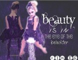
Looks like you used a different font for the first letters of each word...
Fuente identificada: Intimacy
Fuente identificada: Pirulen Bold

Fuente identificada: Vademecum

Fuente identificada: Teen

Fuente identificada: Peace Mustache
>"...Usually, old versions are being shown when there are differences with the new one, so the user who asks for the font knows which one it is, even if he can't download it from here anymore. But he'll still be able to get the new one..."
That clears up some of my confusion, thank you so much for the insight and for your time. But, I too am not *completely* sure I am understanding what you mean correctly either, sorry! What I was am asking about, are the older versions located here at Dafont, i.e. one like "www.dafont.com/font-name-old1.font" -- (it was *this* little nugget of wisdom the magic of Dafont swept clean from the thread)
If it is in fact 'uncouth,' to utilize these links, it's incredibly stupid (for lack of a better word) of me to bring them up again. In that case, I apologize and am grateful for the unyielding patience & understanding of the great magicians of Dafont. Ix-nay on the afont-Day ersions-vay?
Thanks again so much.
That clears up some of my confusion, thank you so much for the insight and for your time. But,
 I too am not *completely* sure I am understanding what you mean correctly either, sorry! What I was am asking about, are the older versions located here at Dafont, i.e. one like "www.dafont.com/font-name-old1.font" -- (it was *this* little nugget of wisdom the magic of Dafont swept clean from the thread)
If it is in fact 'uncouth,' to utilize these links, it's incredibly stupid (for lack of a better word) of me to bring them up again. In that case, I apologize and am grateful for the unyielding patience & understanding of the great magicians of Dafont.
 Ix-nay on the afont-Day ersions-vay?
Thanks again so much.

I see. Is it okay to access those older versions then?

Fuente identificada: Champagne & Limousines
Editado 2 veces. Última edición el 27/03/2013 a las 14:01 por drf_
Just curious, weren't there more replies on this thread? 

I've always liked this font, http://www.eaglefonts.com/the-aeroplane-flies-high-heavy-ttf-141449.htm
It has definitely has a jet-like/winged theme, not sure if you would consider it too silly though. Best of luck to you in your font search.
It has definitely has a jet-like/winged theme, not sure if you would consider it too silly though. Best of luck to you in your font search.

Note that the two 'm' letters are in emmaus are uppercase whereas the rest is lowercase, i.e. It is "eMMaus"
Fuente identificada: Platelet
You're welcome. 


Fuente identificada: Cartonsix NC
Fuente sugerida: Angelic Peace

The "MAISONCLOSE" font is an earlier version of Champagne & Limousines. The version on Dafont is a newer version, in the new version the points on the top of capital letters are flattened. (I know, shouldn't have changed them!)
The older version can be found online if you search for "Champagne & Limousines Version 2"
I found one right now, but I don't know if it is okay to post the link to it here. (I have had links removed from posts before so I don't want to post it here if it's not okay to do so, sorry!)
The second font I do not know.
Fuente identificada: Champagne & Limousines
Fuente identificada: Cinnamon Cake
his is most probably not a font
Huso horario CEST. Ahora son las 00:43
