
Foro
3.821 posts Fuentes identificadas
Posts de donshottype


The Bitstream version of City Bold, with weight increased
Fuente identificada: Square Slabserif 711 Bold
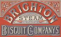
STEAM resembles a variation of Gladiate
Editado el 08/12/2016 a las 17:06 por donshottype
Fuente sugerida: Gladiate
Editado el 08/12/2016 a las 17:06 por donshottype

Fuente sugerida: Excelsis
Fuente identificada: Optima Medium

KIMS: Franklin Gothic Condensed
CONVENIENCE: Franklin Gothic Extra Condensed
CONVENIENCE: Franklin Gothic Extra Condensed
Fuente identificada: Franklin Gothic

Warszawa is a custom handcrafted automobile emblem used for many years.
http://polishpoland.com/tag/fso/
http://www.warszawaprzezwarszawe.pl/
Some fonts have been made in this style, sometimes called chrome connected script, but AFAIK none are an exact match
Among somewhat similar fonts, you could try Raceway
http://polishpoland.com/tag/fso/
http://www.warszawaprzezwarszawe.pl/
Some fonts have been made in this style, sometimes called chrome connected script, but AFAIK none are an exact match
Among somewhat similar fonts, you could try Raceway
Fuente sugerida: Raceway
A fashionable Art Nouveau lettering style from the mid 1890s.
Book written by Dr. G. Hartwig and published by Longmans, Green & Co. in 1893. Cover artist unknown.
Closest font is Bambus Grotesk produced by the Emil Gursch foundry in 1896.

AFAIK no digital version.
Book written by Dr. G. Hartwig and published by Longmans, Green & Co. in 1893. Cover artist unknown.
Closest font is Bambus Grotesk produced by the Emil Gursch foundry in 1896.
AFAIK no digital version.


Handlettered generic Roman capitals.
The most distinctive feature is the calligraphic Tuscanesque terminals on parts of some letters that are derivied from Richard Lipton's Arrus
The most distinctive feature is the calligraphic Tuscanesque terminals on parts of some letters that are derivied from Richard Lipton's Arrus
Fuente sugerida: Arrus Bold

HWT Bulletin Script Two is a modification of Bulletin, which has the rounded bulbous bottom terminals shown in the image.
Aka Smoke, Psychedelitype, Baghdad Backslant

Editado el 06/12/2016 a las 11:39 por donshottype
Aka Smoke, Psychedelitype, Baghdad Backslant
Fuente sugerida: Bulletin Script Two
Editado el 06/12/2016 a las 11:39 por donshottype

Agree this is probably not a font.
For a similar effect you might try Kuno Handwriting
For a similar effect you might try Kuno Handwriting
Fuente sugerida: Kuno Handwriting

Custom logotype.
Letterforms look like they are derived from Matrix II Wide, made bolder and with a unique serif pasted on the top lhs of _R_
Letterforms look like they are derived from Matrix II Wide, made bolder and with a unique serif pasted on the top lhs of _R_
Fuente sugerida: Matrix II Wide
Apply less leftwards slant, like so


These are embroidery fonts, for use on an embroidery machine.
Embroidery fonts have very open counters and scripts are almost upright to enable the machine to produce a letter that is relatively legible.
If you compare the computer versions of some fonts that have been converted to embroidery fonts, the embroidery version is stiff and rather clunky.
Converting the embroidery fonts I mentioned to a versions usable on a computer is a DIY project that includes a lot of editing to deal with the stiff and clunky nature of the letter-forms.

The embroidery machine has mangled some of the details, but this is definitely Arnold Böcklin
Fuente identificada: Arnold Boecklin
Huso horario CEST. Ahora son las 15:39
